"I included this case study to highlight a side of UX that’s underrated: designing for what goes wrong. While we aim for seamless happy flows, complex systems have limitations, and so do we. This work is about honesty, trust, clarity, and support into those moments. Helping users understand what’s happening, what’s possible, and when it’s okay to walk away." 🌱

Overview

01 - Impact
Key Achievement
Mapped 90% of known system errors to actionable user-facing messages.
Designed a scalable error framework usable across embedded screens closely aligned with web and mobile.
Built alignment across teams (design, backend, diagnostics, copy) despite system limitations.
Prioritised honesty and clarity over false assurance, supporting users even when the system couldn’t.
Balanced white-label requirements with UX consistency for flexible third-party integrations.
OKRs Improved
4
Average Improvement
37%
40% ↑
Reported by QA and system architects
Reliability OKR
50% ↑
Based on follow-up survey data and repeat usage
User Satisfaction OKR
25%↓
Observed in common charging-related issues
Customer Support OKR
30% ↑
Noted during usability test handovers and implementation reviews
Team Efficiency OKR
We had 24 backend system errors… but only 2 ever made it to the user interface. The rest?
Either mysteriously silent or thrown into a generic “Something went wrong” screen, leaving drivers puzzled and pressing that support call button like it was the only option. That led to two problems:
User Problem
Drivers had no clue what went wrong, or what to do next.
Support Problem
Support teams faced long, unclear calls decoding issues the system UI didn’t explain.
Design challenge
How might we turn a backend-heavy error system into a user-friendly, scalable guidance experience without turning the interface into a flashing dashboard of doom?
1/6 Stakeholder Interviews
I interviewed and collaborated with System Architects, Support Staff, Engineers, and Copywriters to understand errors, feasibility, and ensure clear, accurate messaging.
What I found: A classic misalignment!
Sometimes what the support scripts said to do and what the UI actually showed were different messages.
System architects revealed that each error code had its own unique design, not a reusable UI pattern, which made the system chaotic. Imagine scaling up: 24 errors, 24 different UIs. The ultimate recipe for confusion.
Opportunity: Align UI, support scripts, and system architecture by creating scalable, reusable error patterns.
2/6 Who Am I Designing For? Meet the Personas
EV Drivers (Primary)

Needs: Clear, simple error messages with easy steps to get back on the road fast.
Challenges: Limited technical knowledge, outdoor use, and stress when errors happen.
Support Teams (Secondary)

Needs: Clear, consistent error messages and actionable steps to diagnose and resolve issues efficiently.
Challenges: Limited by what the user can see or describe.
Opportunity: Build a scalable error system that guides users clearly, and streamlines customer support.
Collaboration: Worked with the 2 product managers and a system architect to make sure personas reflected technical constraints, product scope, and business goals. Worked with customer support reps (to capture recurring user pain points) and end users (via interviews or usability testing) to ensure the personas reflected actual needs and behaviour, not just internal assumptions.
3/6 Competitive Analysis
I reviewed how Alfin, EnBW, and ChargePoint handle errors. Their approaches were mostly the same, often vague or overly technical messages.
Opportunity: Be the friendly guide with simple, clear errors that helps users understand why and how to fix it.
Collaboration: Worked with PMs to select relevant competitors.
4/6 Support Documents Audit
Dug through 40+ support cases and realised that, despite seeming otherwise, users really only had 4 possible actions: wait, unplug/replug, reboot, or call support to resolve issues at the charging station.
Opportunity: Simplify errors by focusing on the 4 key user actions, making solutions clear and easy to follow.
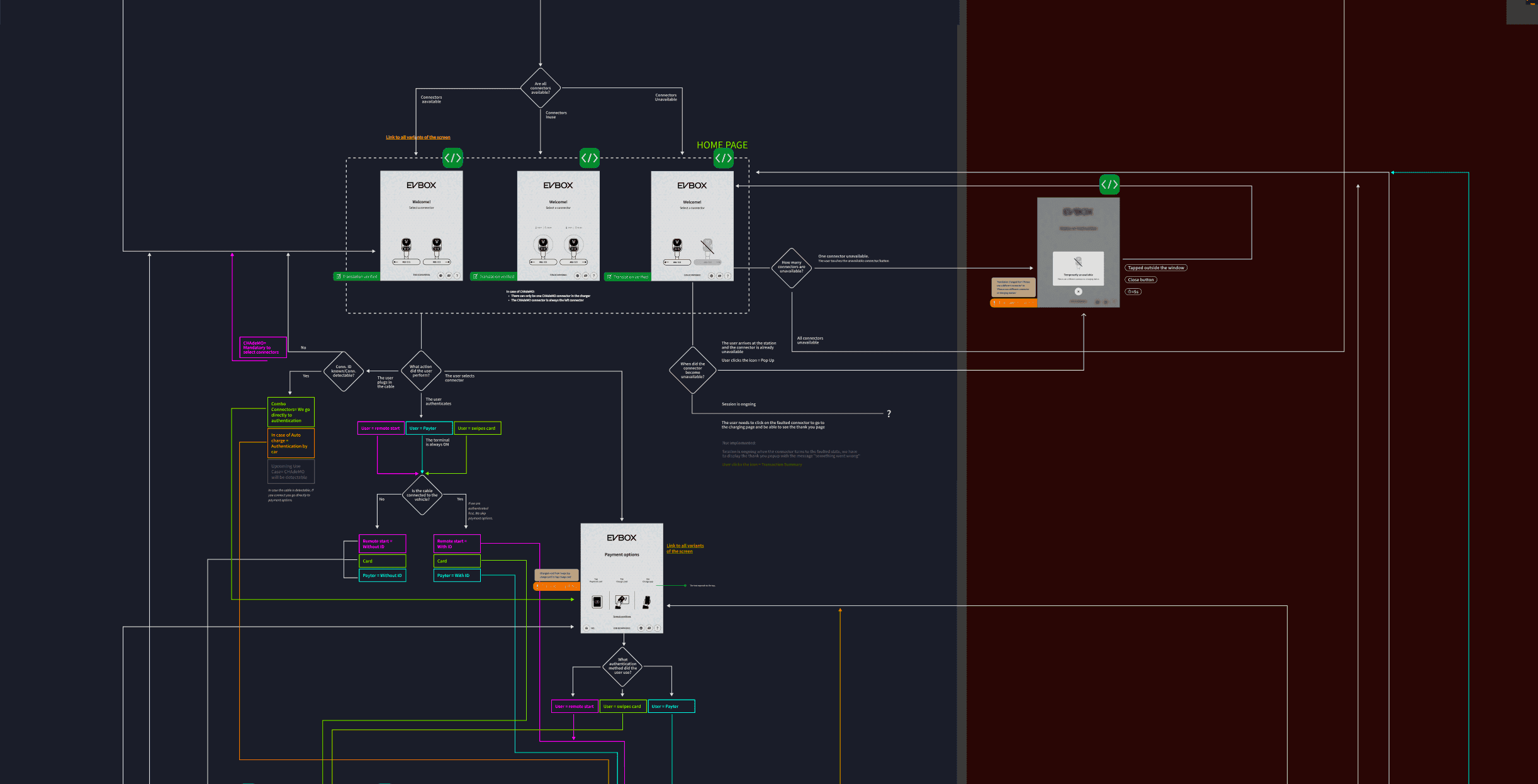
5/6 User Flows
Mapped end-to-end flows to spot where errors strikes.
Collaboration: Held weekly sessions with PMs, system architects, and developers to map end-to-end user flows, identify where errors occur, uncover pain points, and understand technical limitations
Opportunity: Use error context to deliver targeted, relevant messaging showing only what users need to see and keeping background issues under the hood.
6/6 USer/Validation Testing - ROund 1
For validation testing, I engaged teammates from other departments who were unfamiliar with the project. I placed printouts of the screens inside the charger to simulate the interface for testing.
Result: Users appreciated transparency but felt uncertain about what steps to take. Leading to clearer action-first messaging.
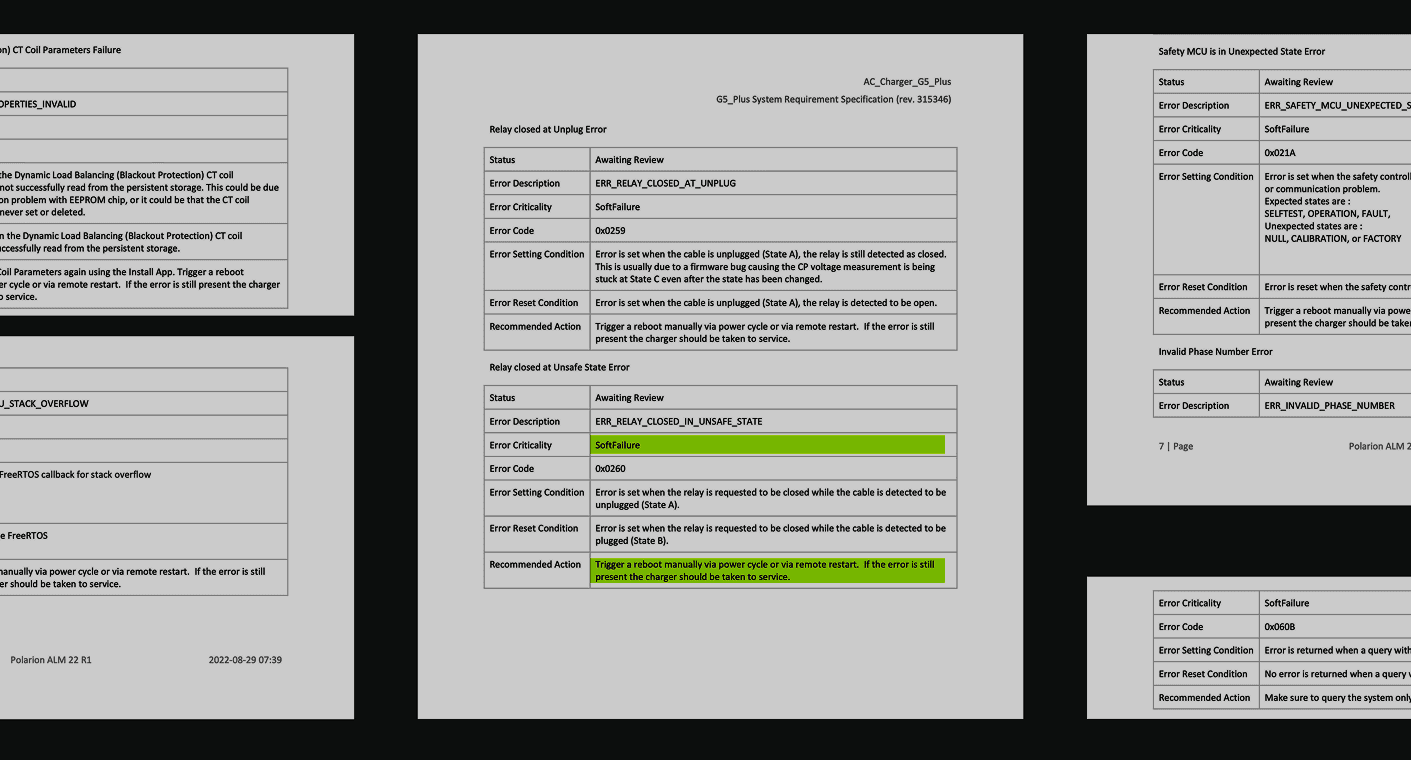
1/1 Error Mapping Framework
After discovering the key user actions from support, I collaborated with system architects to categorise errors, creating a master matrix that linked:
Collaboration: Met with the system architect multiple times a week, working side by side until the framework emerged.
System errors
(Backend technical
identifiers)
Backend cause
(Root technical
problem)
User solution
From support
data analysis
UI response
Visual pattern
and messaging
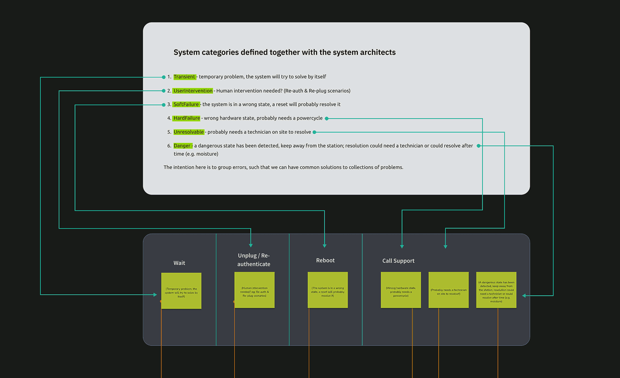
⭐️ Key Achievement: Grouped 24 errors in 5 clear categories, each going to get mapped to a single visual pattern and user action creating a scalable system that can handle future errors. Opportunity found in stakeholder interviews and support docs audit implemented here.
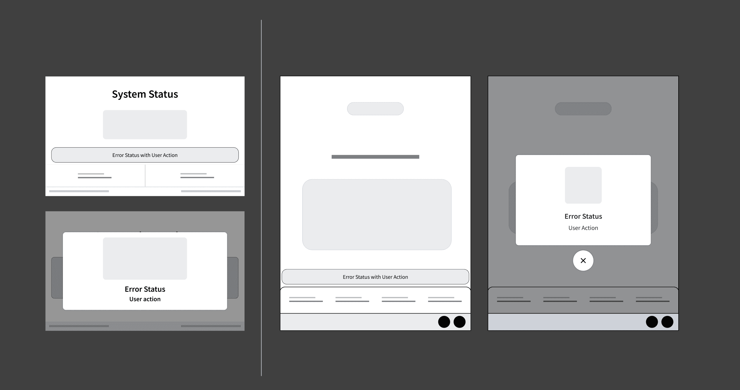
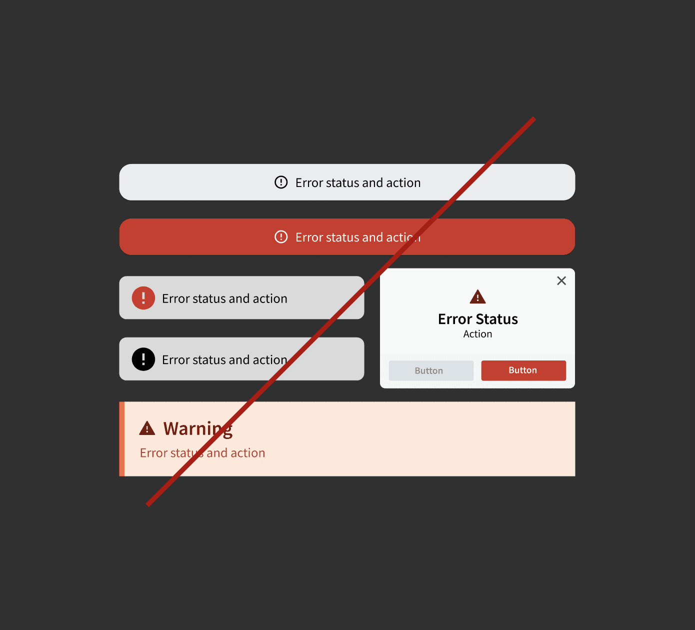
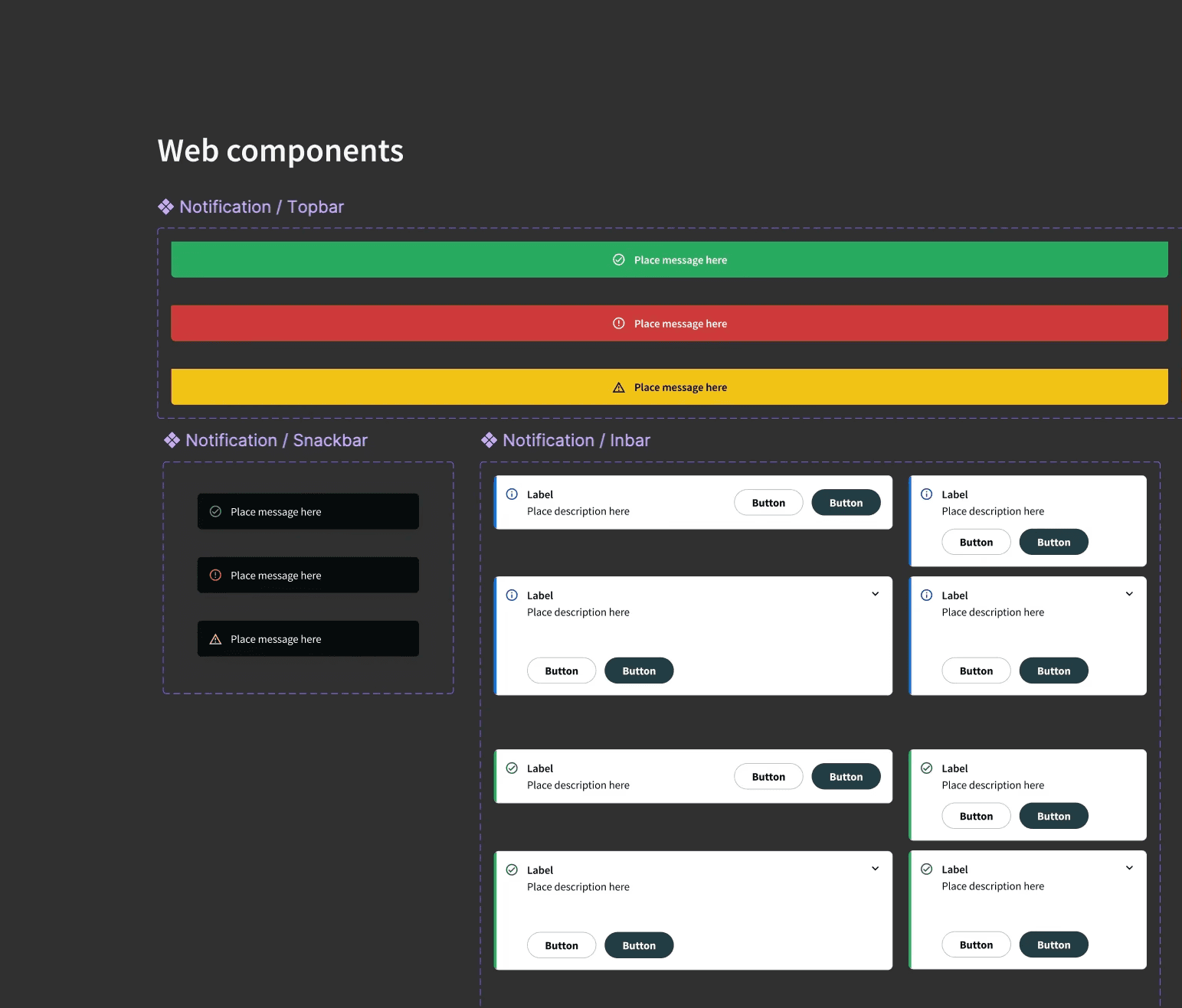
2/2 Early Concept Sketches to Identify The UI Patterns
Audited error UIs across platforms to identify patterns and define a flexible, consistent structure for clear user guidance.

Result: Snackbar and pop-up modals proved fit as they adapt across devices, fit screen limits, and were in our design system.
Design Constraints
- Wide range of screen sizes. Tiny embedded to large touch/web/mobile
- Consistent experience across platforms and white-label branding
- Short, clear messages optimised for translation into 10+ languages
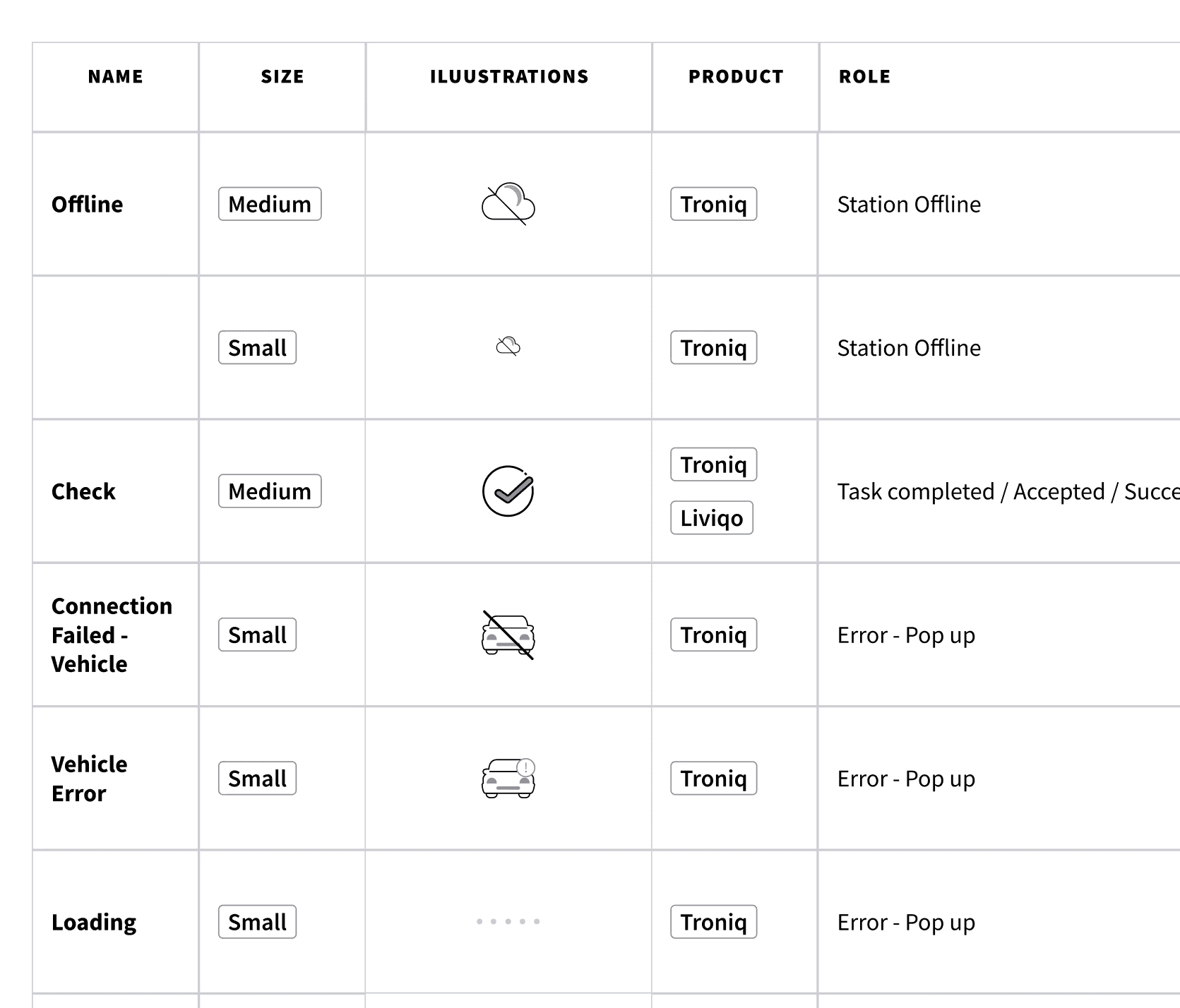
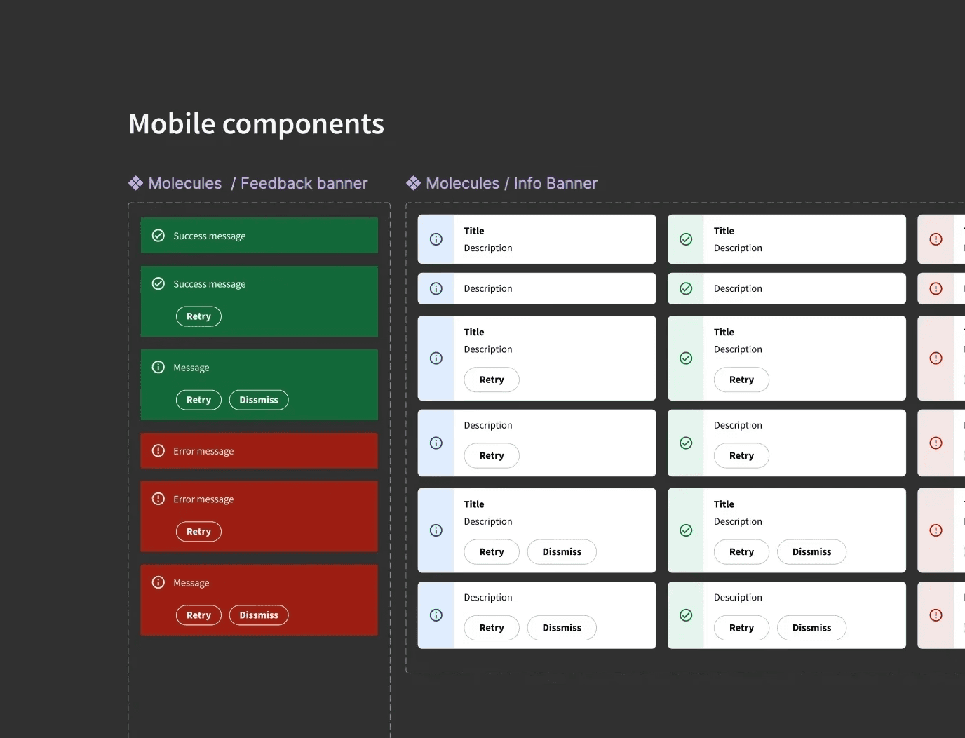
1/5 Wireframes & UI Concepts
2/5 USer Testing | Round 2 (Clarity of Interactions)
Focused on refining wording, visuals, and interaction cues for different error states. I again engaged teammates from other departments who were unfamiliar with the project. With help from developers, I replaced the screens in the charger and set up a lab environment simulating demo screens to observe real user interactions and gather unbiased feedback.
Result: Users better distinguished wait, replug, and abandon actions. Copy (too technical) and LED animations (too strong blinking) needed revision. I redesigned and created new illustrations and iconography for clarity in our design system.
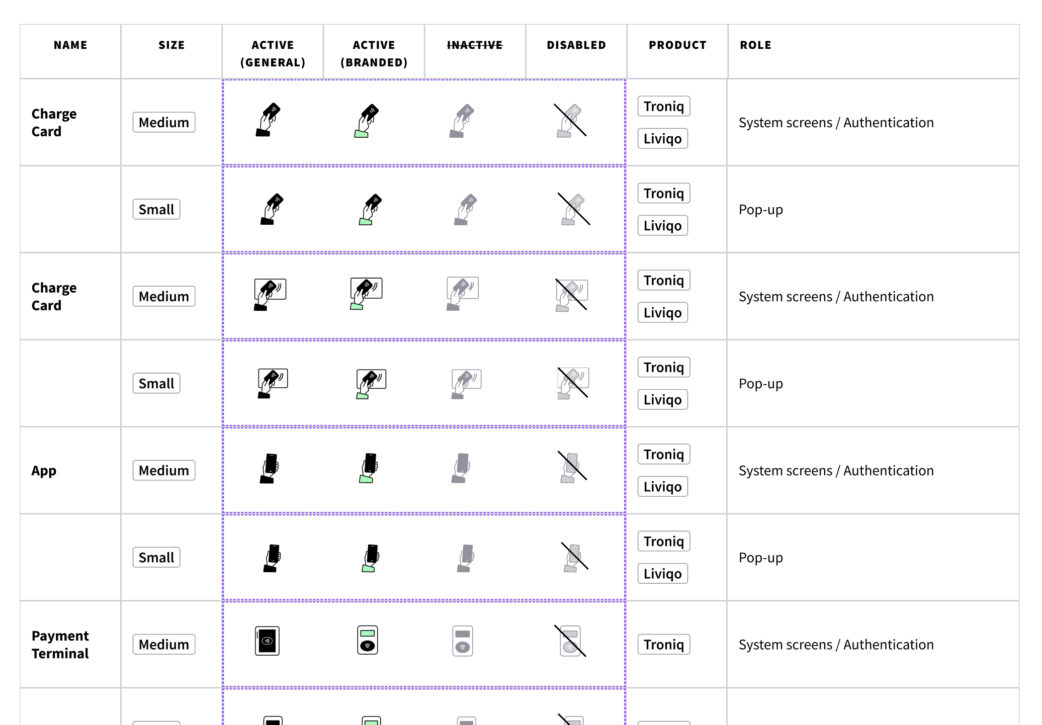
3/5 Hi-Fidelity Designs & Overall Solution
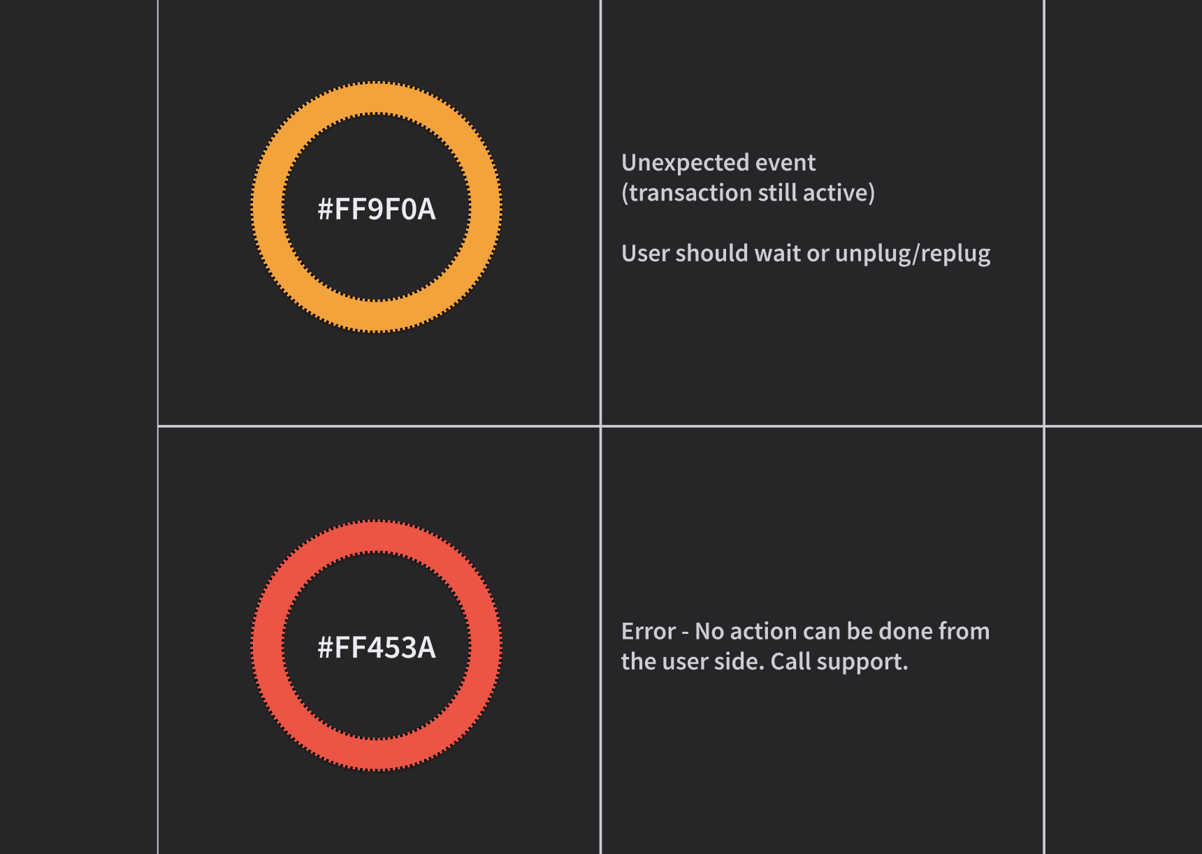
Limitation: Our shared goal was to release with both error status/cause and user actions. The team was aligned, but the diagnostics teams needed more time to overcome backend limitations. So, the first release included only user actions, with error causes added in the next versions diagnostics improved.
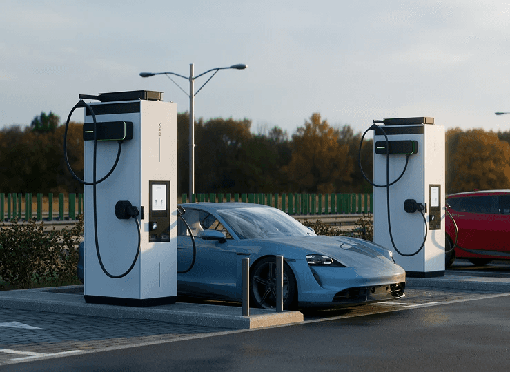
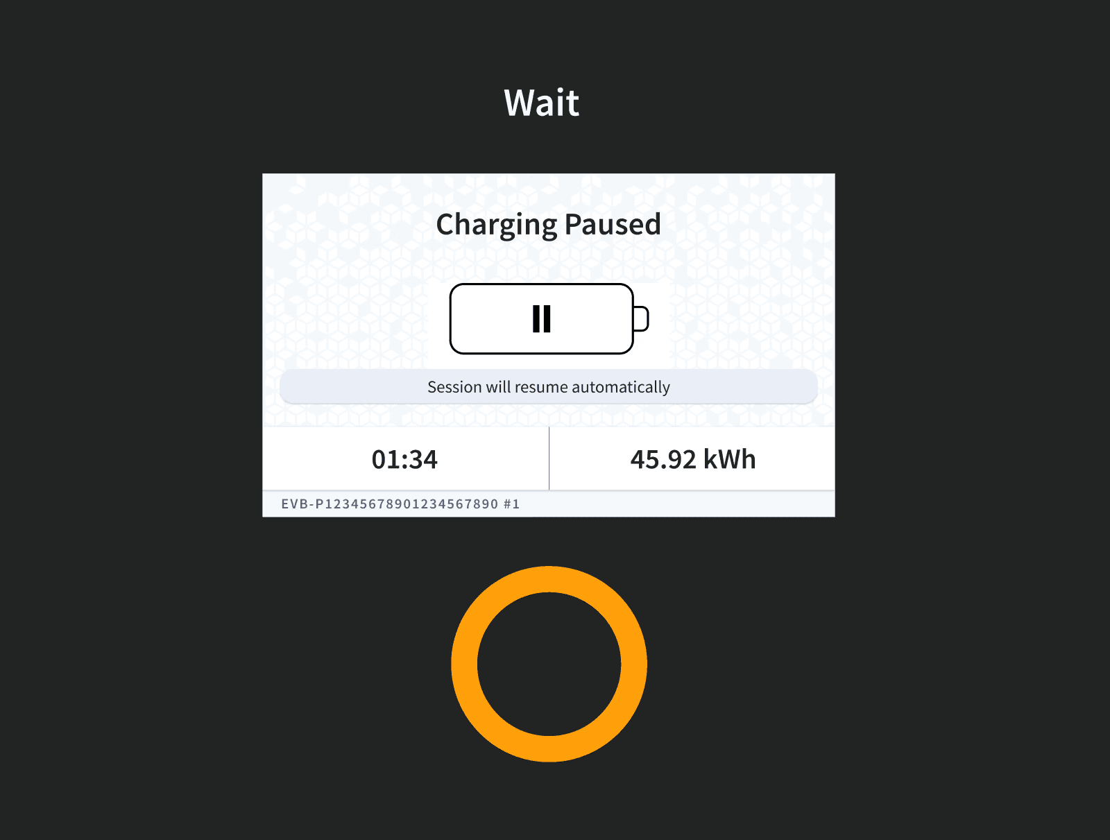
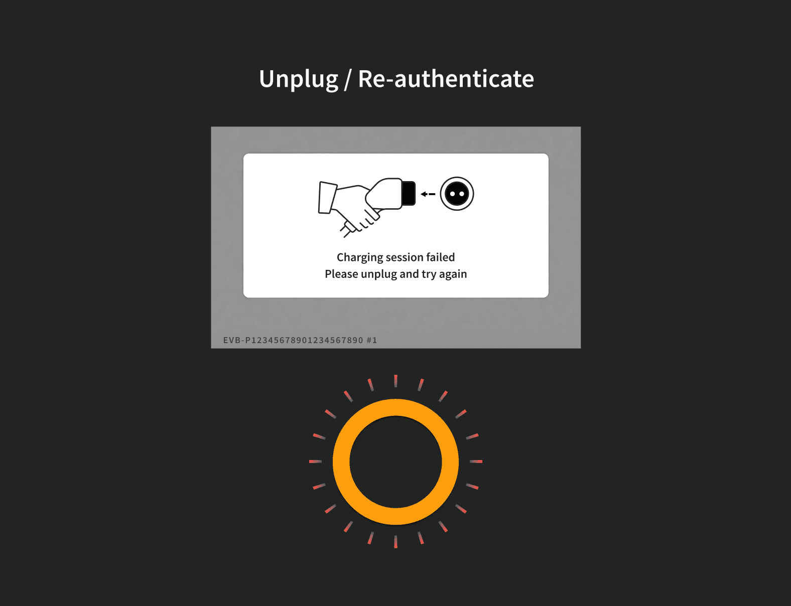
Result: 🟠 Orange LED light indicates to users away from the car that the session is paused.
Steady = wait | Blinking = unplug and replug to resume
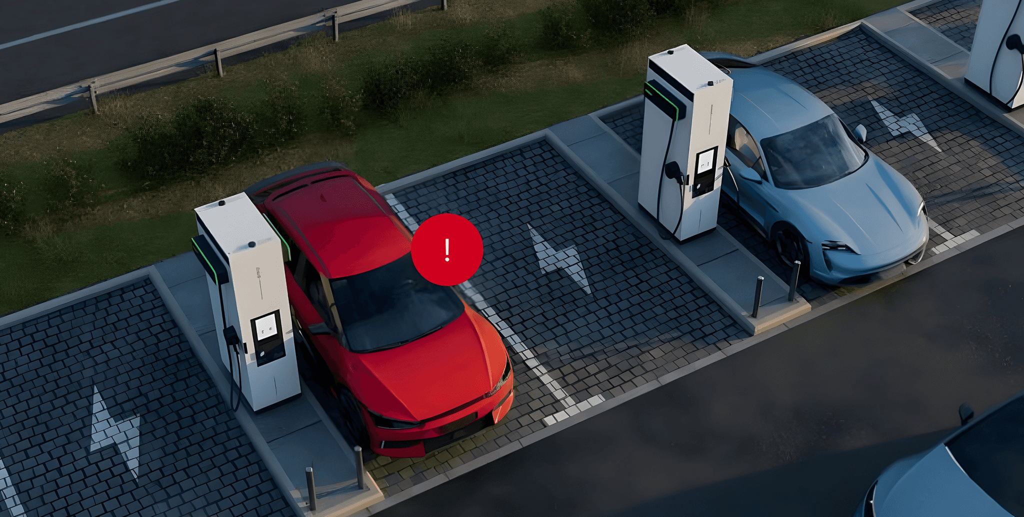
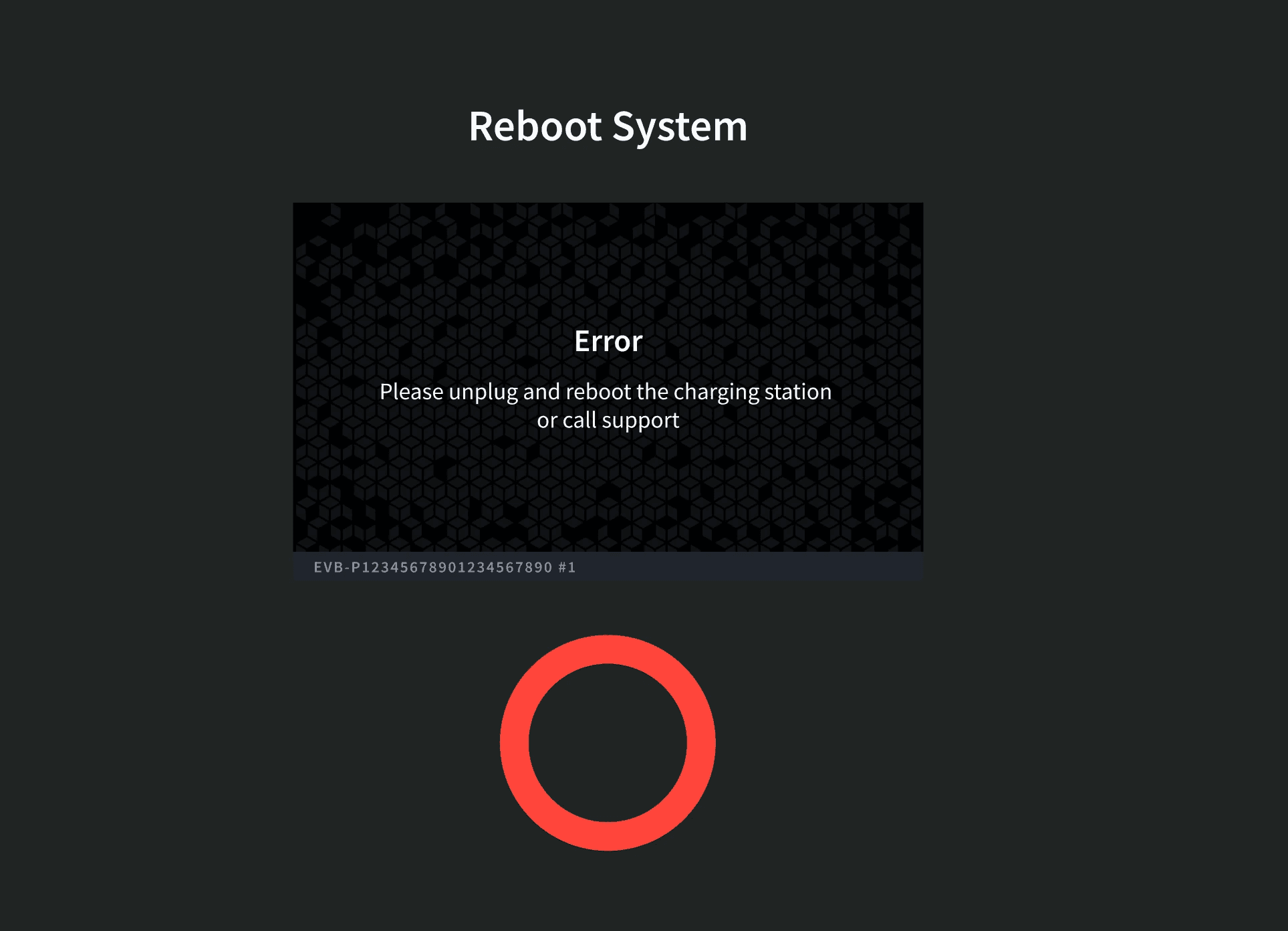
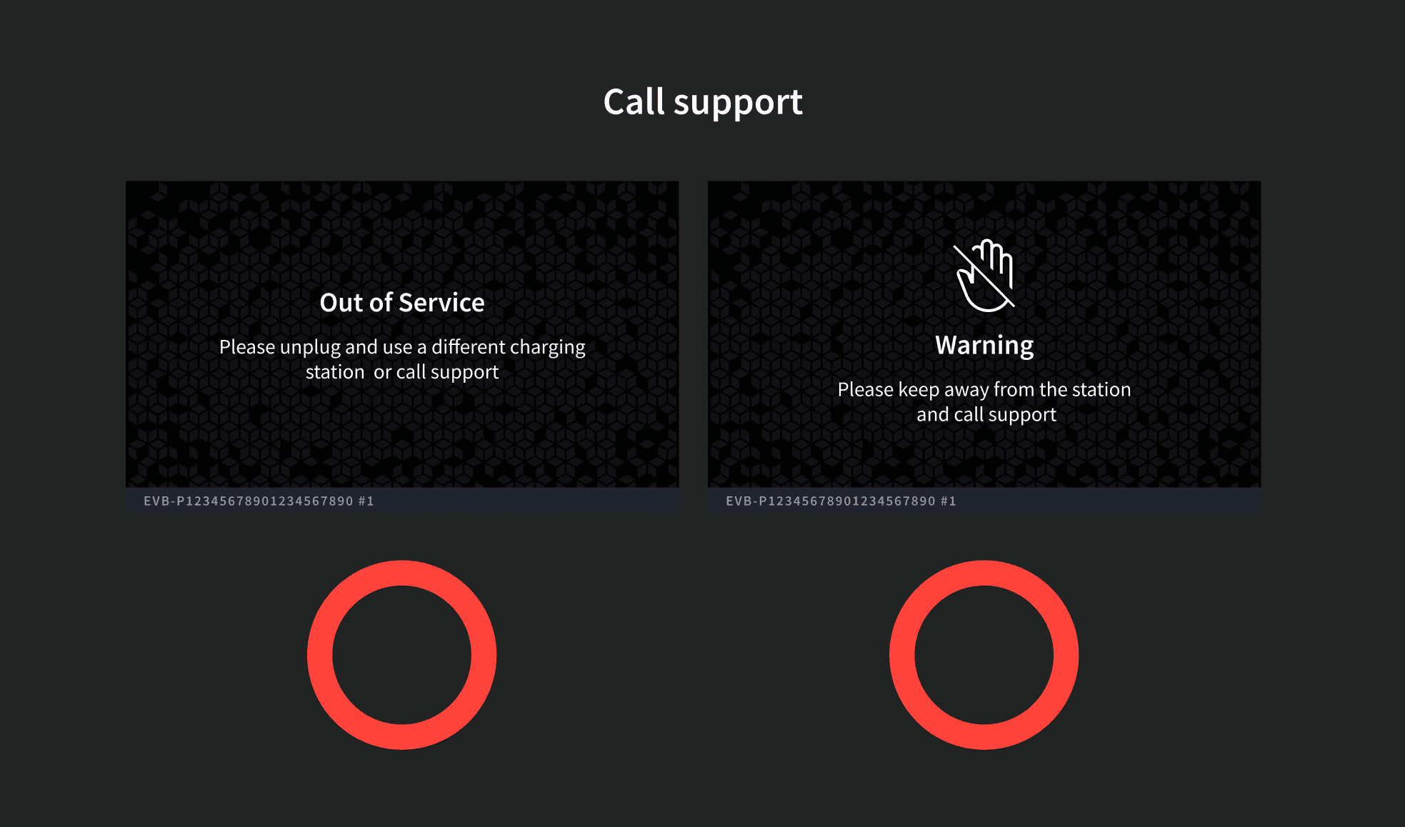
Result: 🔴 Hard red light + inverted UI signals a critical error, designed to be visible from afar, alerting users that the charger is unavailable before parking. 💬 Dual message on screen: For fleet/maintenance/private chargers = reboot or call support | For public users = use another charging station
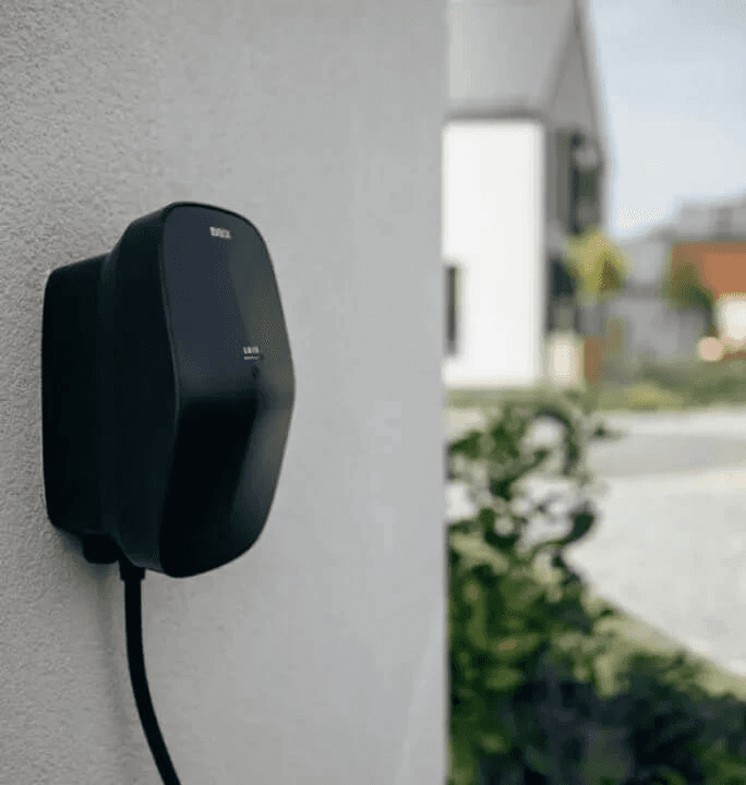
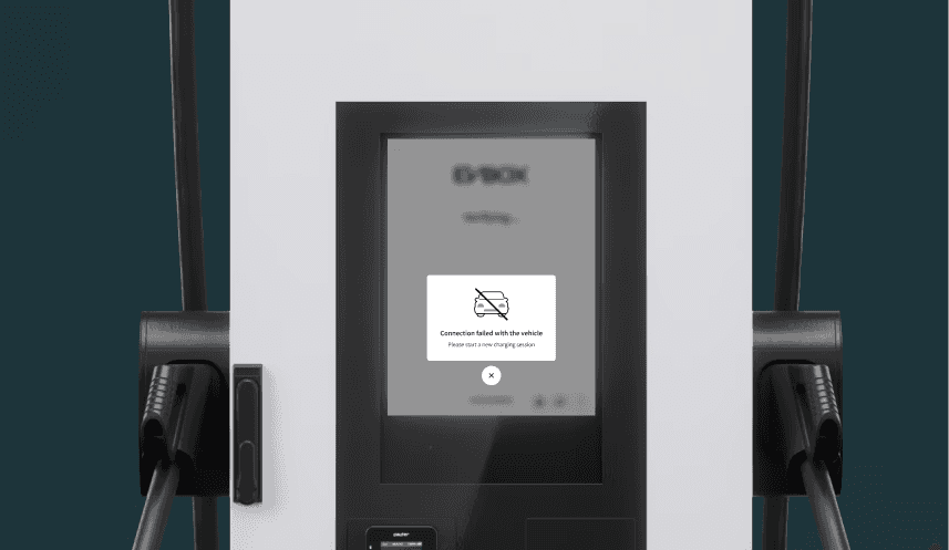
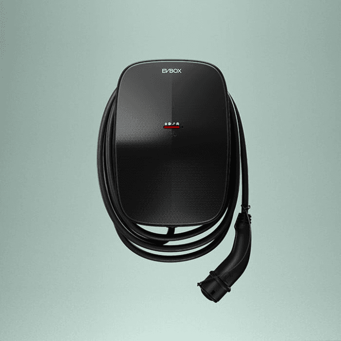
4/5 Product pictures with implementation

Limitation: I achieved 60% alignment across web and mobile by applying consistent logic and interaction patterns. Full alignment wasn’t possible due to backend constraints, and the chargers had to remain highly white-labeled to stay compatible with various third-party systems.
5/5 USer Testing | Round 3 (High-Fidelity Validation)
I simulated real-world scenarios using hi-fi designs in context. This time, I recruited new joiners for testing, providing an opportunity to gather fresh insights from people who had never used or heard of the project. It also served as a mini-orientation, showcasing what I do and how our product’s UX and UI is designed.
Result: Confirmed faster recognition of error types, increased user comprehension (50%↑). Minor copy + visual corrections were made.
"We are now expanding this error-handling model to other products, it is clear and scalable." - Product Management
Going into the process, the project felt incredibly complex - full of technical details and moving parts. I expected the solution to be just as big and complicated. At first, there was a sense of fear and resistance, unsure how to untangle the unknowns. But as I gained knowledge and visibility into the systems, the path forward became clearer and less fearful. What once seemed overwhelming transformed into something manageable, proving that understanding is the first step toward simplicity. - My thoughts