"I included this case study to show that UI isn’t just about how things look-it’s about how they scale and adapt. Designing for a single perfect flow is easy; designing for a living, evolving system that can also flex into multiple brands is where the real craft lies. This work is about building flexibility into the interface so it can adapt to different user behaviours, market demands, and white-label needs without starting from scratch. It’s about creating a design language that’s consistent yet customisable, guiding without overwhelming, and ready to grow without breaking. Because in complex systems, adaptability is usability 🌿."
UI Strategy
Design Systems
Timeline
~1 Years
Employer
EVBox
Role
UI Designer
Overview
01 - Impact
Key Achievement
Flow efficiency: Reduced from 13 mandatory steps to as few as 5 (and 0 clicks in plug-first cases), improving turnaround time at chargers and reducing queue friction.
User flexibility: Eliminated dead ends across authentication/connection flows, supporting more real-world scenarios.
White-label scalability: Built a customisable framework that allows clients to adapt chargers to their brand identity without impacting the core system. This reduced deployment time.
Market readiness: The system was designed to accommodate future market and regulatory needs without major redesigns - supporting long-term product viability and partner confidence.
25% ↑
Task success rate
Reported from usability tests.
100% ↑
Dead-end coverage
Verified in QA for all real-world flows (plug-first, authenticate-first, select-first).
~40% ↓
Measured during usability testing (steps reduced from 13 to as few as 5.)
25% ↑
Noted during usability test handovers and implementation reviews
The old UI (v4.4) was functional, but its design made everyday tasks harder, reduced operational efficiency, and slowed down how quickly we could adapt the product for different brands and markets - something essential to staying competitive in the EV charging industry.
User Problem
Rigid flows that didn’t adapt to user behaviour - for example, if someone plugged in first or tapped their card on the RFID reader to pay directly, the charger wouldn’t respond at all.
High interaction overhead: 13 steps in the main flow compared to a potential 5–6 in optimised flows.
White label: Static customisation options limited to logos and images, making white-labelling slow and costly.
Limited guidance for physical actions like cable selection.
Inconsistent accessibility: language change only available at startup.
Overloaded information hierarchy showing non-essential details.
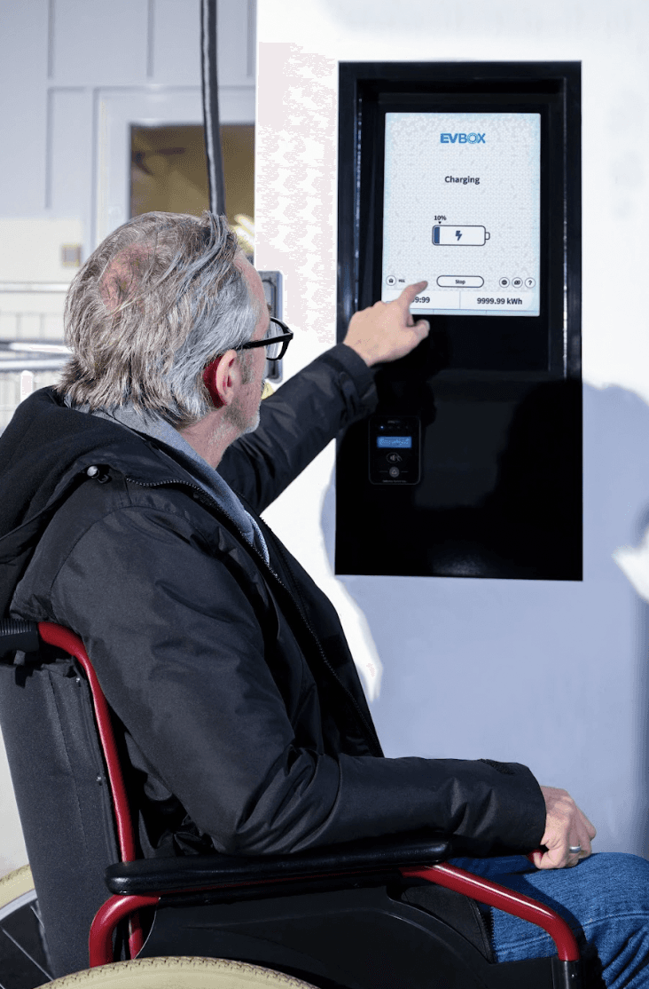
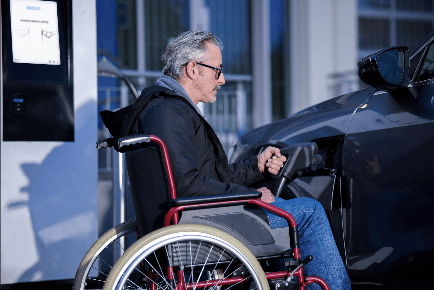
Wheelchair accessiblility
Design challenge
How might we redesign the interface so it’s intuitive, flexible to different user behaviour, and scalable for brand and market needs, while reducing steps, guiding physical actions, and ensuring consistent accessibility and error handling?
1/6 Stakeholder Interviews
Collaboration: I held workshops and interviews with PMs, system architects, developers, and support teams to understand project goals, reasons for change, and set realistic timelines. Weekly meetings kept us aligned on system status and ongoing issues.
What I found: These sessions revealed technical constraints, maintenance challenges, user pain points, and accessibility needs like wheelchair accessibility, helping us design a practical and effective solution.
Opportunity: The designs needed more adaptable authentication system, streamlined real-time maintenance support, a scalable white-label framework, and enhanced accessibility features to improve user experience and operational efficiency.
2/6 Who Am I Designing For? Meet the Personas
Name: Emma Janssen, Age: 40
Occupation: Marketing Specialist, Location: Rotterdam
Goals:
Start charging her EV quickly and effortlessly.
Access real-time station status and payment options.
Have a smooth experience without needing extra guidance.
Frustrations:
Charging stations that don’t update availability in real-time. Interfaces that overcomplicate basic actions.
Needs:
Prefers minimal clicks, clear prompts, and intuitive navigation. Looks for visual clarity and efficient workflows. Expects consistent experience across multiple locations and stations.
Name: Mark de Vries, Age: 34
Occupation: Accountant, Location: Arnhem

Goals:
Find EV charging stations that are fully wheelchair-accessible. Complete charging tasks quickly and independently.
Challenges:
Charging stations that are hard to reach or poorly documented. Inconsistent interface guidance that assumes mobility.
Needs:
Prefers clear visual cues, step-by-step guidance, and accessible hardware. Appreciates real-time updates on station availability. Expects seamless integration between app and physical station for autonomous use.
Opportunity: Design a flexible and inclusive EV charging experience that works seamlessly for both everyday users and those with accessibility needs, ensuring step-by-step guidance, real-time updates.
Collaboration: Worked with PMs to get insights on who we are designing for.
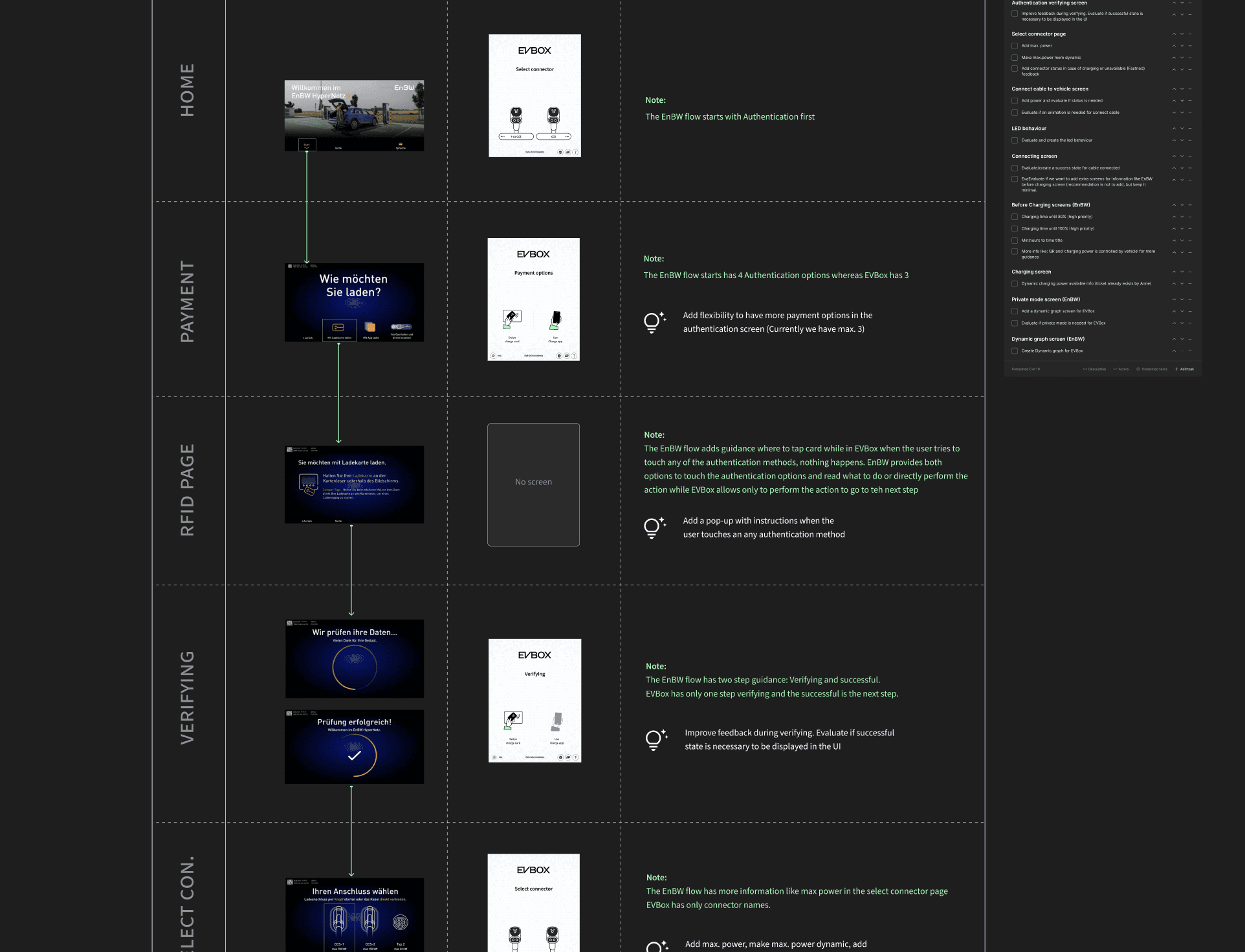
3/6 Competitive Benchmarking
I worked with my PM to analyse interfaces from leading EV charging systems. The review highlighted best practices in adaptive flows, error messaging, and white-label customisation, showing how competitors supported flexible user behaviour and dynamic branding.
Opportunity: Balanced usability and customisation to deliver a flexible, scalable, and future-ready user experience.
Collaboration: Worked together with the PM and held occasional discussions with the engineering team to understand technical feasibility.
4/6 USer Validation Testing
I tested the existing UI (online and in-person in our office lab) to analyse which information was redundant and which elements could be improved. To gain fresh insights, I involved teammates from other departments who were unfamiliar with the project.
Result: Testing revealed confirmed and revealed several pain points: on-screen timers were stressful, instructions for which side of the cable to plug were unclear, long sentences didn’t read like actionable steps, and the time to reach the charging stage felt too long. Additionally, if users plugged in the cable or tapped their card before selecting “connect” on the screen, the charger wouldn’t respond, causing confusion.
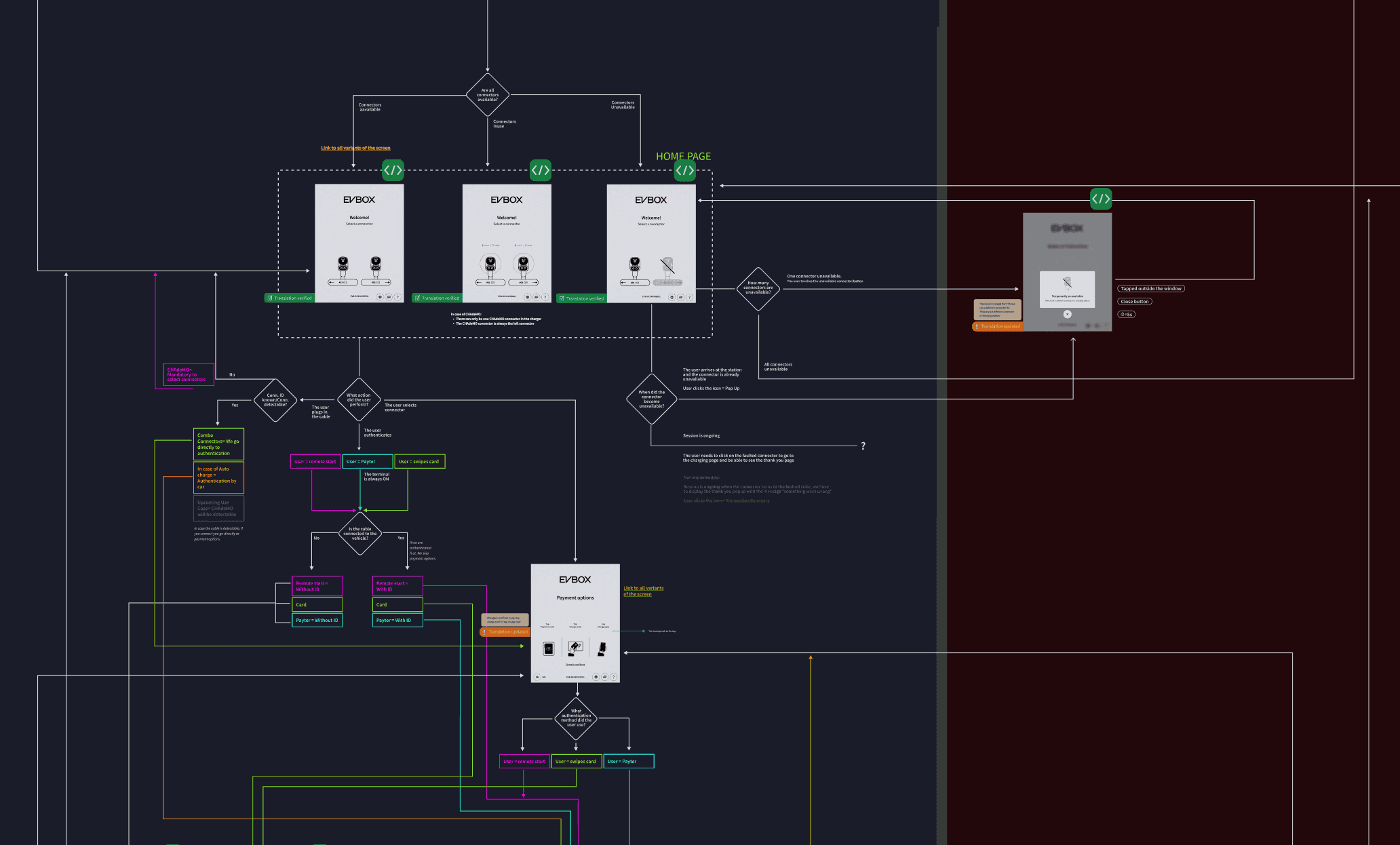
5/6 User Flows
Mapped end-to-end flows to understand the context of each UI element, determine where screens would appear, and identify how many variations were needed for different markets.
Opportunity: Identify where technical UI inconsistencies or redundancies could occur across markets. Create a scalable design system that adapts to different user needs and regional requirements.
Collaboration: Held weekly sessions with PMs, system architects, and developers to map end-to-end user flows, uncover pain points, and understand technical constraints, ensuring the redesign addressed real-world needs.
6/6 ADA-Weelchair Anlaysis
I conducted an ADA wheelchair accessibility analysis, collaborating with engineering teams to identify how to make our chargers fully accessible.
Result: By placing all buttons and interactive elements within 200px from the bottom of the screen, we can create a more inclusive experience, enabling wheelchair users to operate charging stations independently and efficiently.
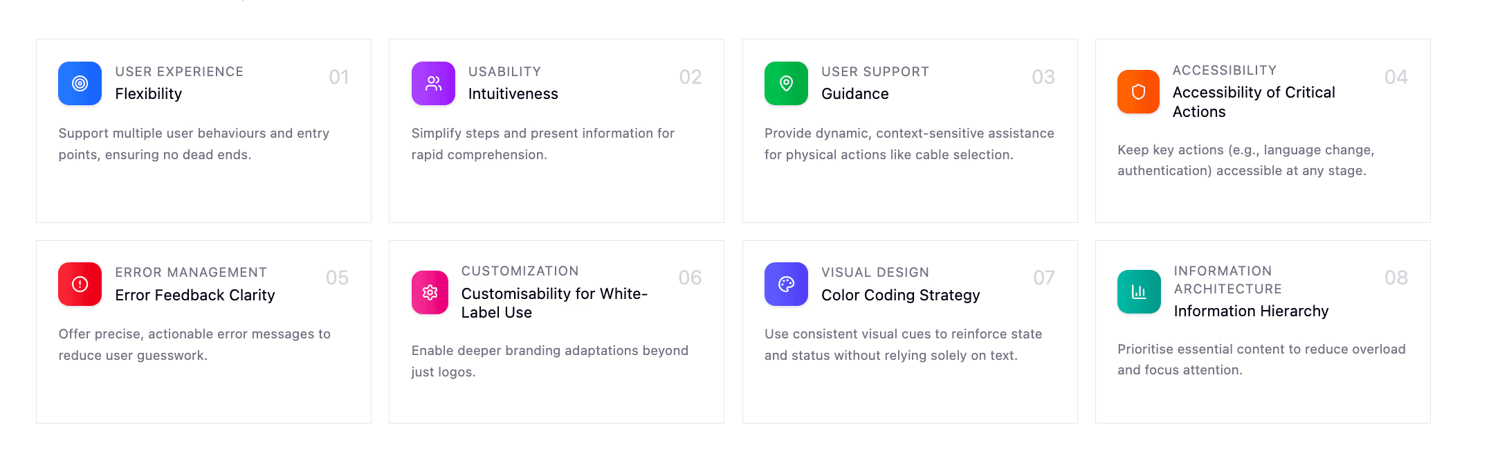
1/3 UI Strategy for Redesign
Based on insights from flow analysis, competitive research, stakeholder feedback, and user testing, the redesign was guided by eight core UI principles:
⭐️ Key Achievement: This strategy delivered a seamless, intuitive charging experience that empowered users to complete sessions quickly and confidently, regardless of their prior EV knowledge. For the business, it established a flexible, white-label-ready UI framework that reduced customisation time, improved cross-market scalability, and minimised support costs by lowering user errors and service calls (Case study: Errors).
2/3 Initial Designs Aligned with Strategy For TEsting
I developed the design flow and visual concepts, iterating through multiple ideas before moving to testing. Many assets were already part of the existing design system, making it easy to quickly build high-fidelity screens.
Opportunity: Leverage the existing design system to accelerate prototyping, maintain brand consistency across products, and focus more on solving usability challenges rather than rebuilding core UI elements from scratch.
3/3 Rapid USer Testing - 6 rounds
I conducted six rounds of rapid testing. Starting with the initial design, then gathering feedback, spotting issues, and improving flows, visuals, and interactions after each round.
Testers included colleagues, both experienced EV drivers and new users from different teams and countries. Using high-fidelity assets from the design system made each iteration fast and efficient. Tests were conducted online and in-person in the office.
Result: The process produced a clear, intuitive, and accessible UI, with at least 80% confirmation of understanding.
Case study Constraints
To summarise six rounds of testing without overwhelming the case study: the flows were technically feasible and highly appreciated by users. Key improvements included:
- Added a stop button to end sessions more clearly
- Refined illustrations, like cable sides and active connections
- Removed timers and shortened sentences into clear step-based instructions
- Improved the receipt, including a QR code for users to take a copy on their phone
- Removed irrelevant dates and other information from the charger interface
- Tested better web configuration to support white-labelling
- Improved illustration colours to ensure brand customisation doesn’t compromise UI messaging (e.g., brand red no longer appears as an error)
1/2 Design system
After finalising the concept, I built a comprehensive design system, including:
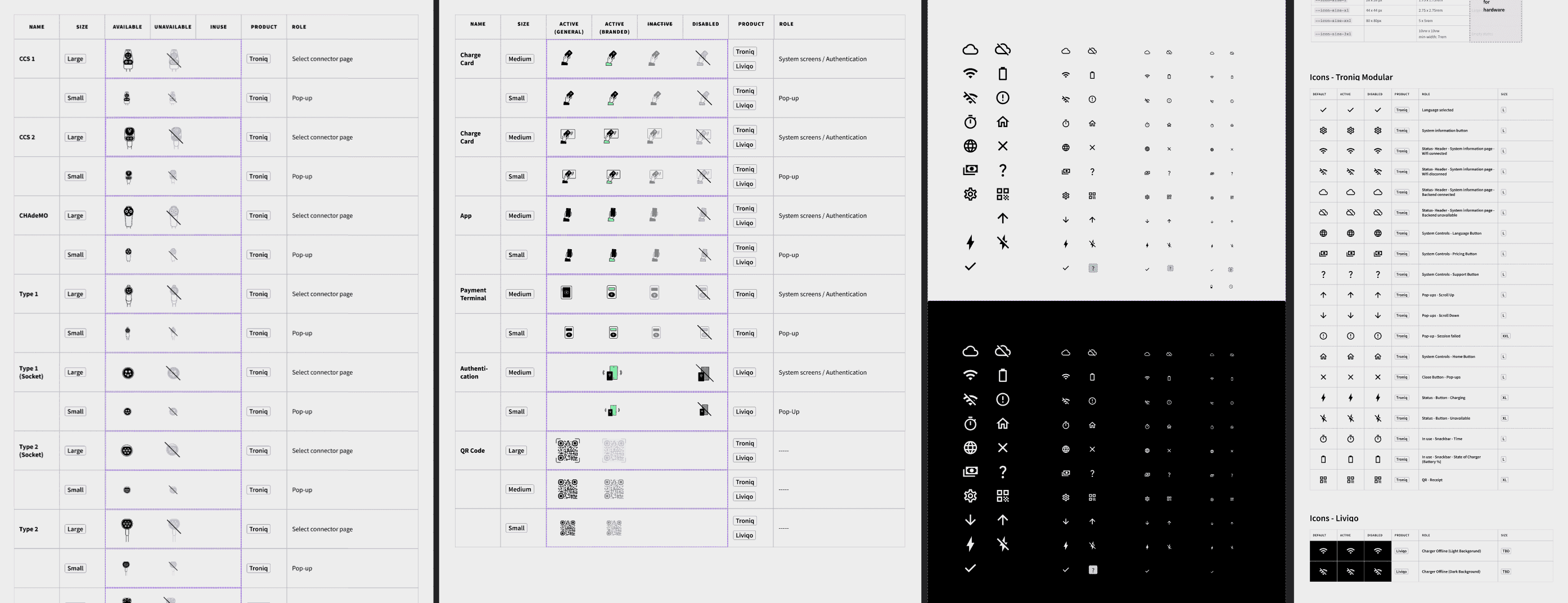
1. A master system included shared fonts, colours, icons, and illustrations.
2. A product-specific sub-system that mapped each component to its exact step in the UI flow, using an infographic-style layout to make it immediately clear where and how each element appears.
*Picture of the master system included shared fonts, colours, icons, and illustrations.
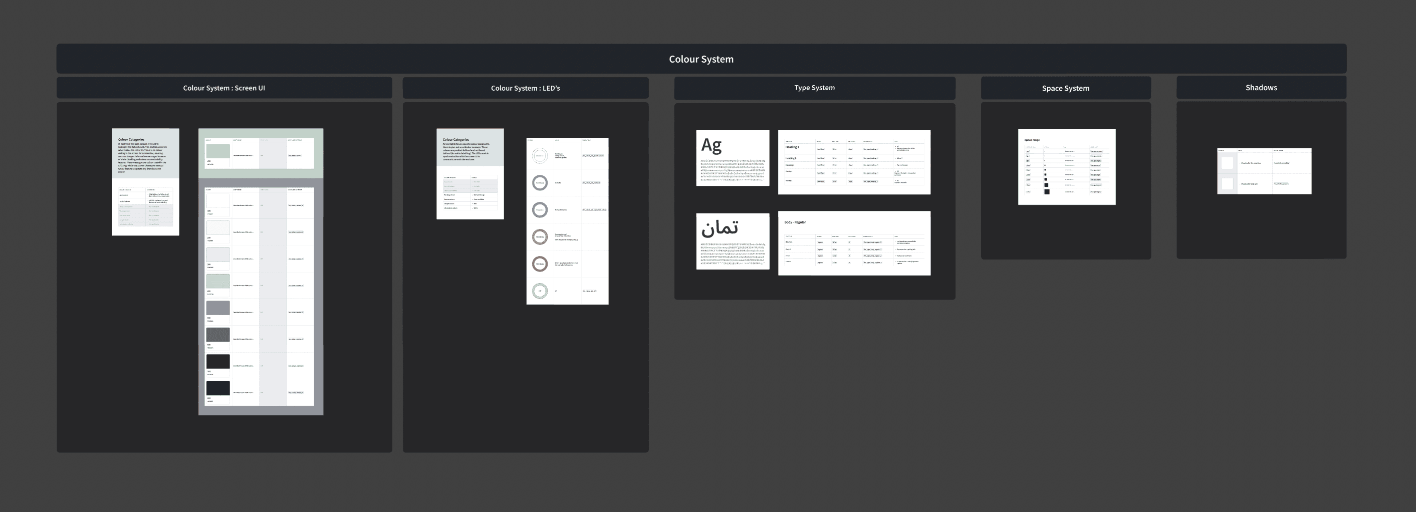
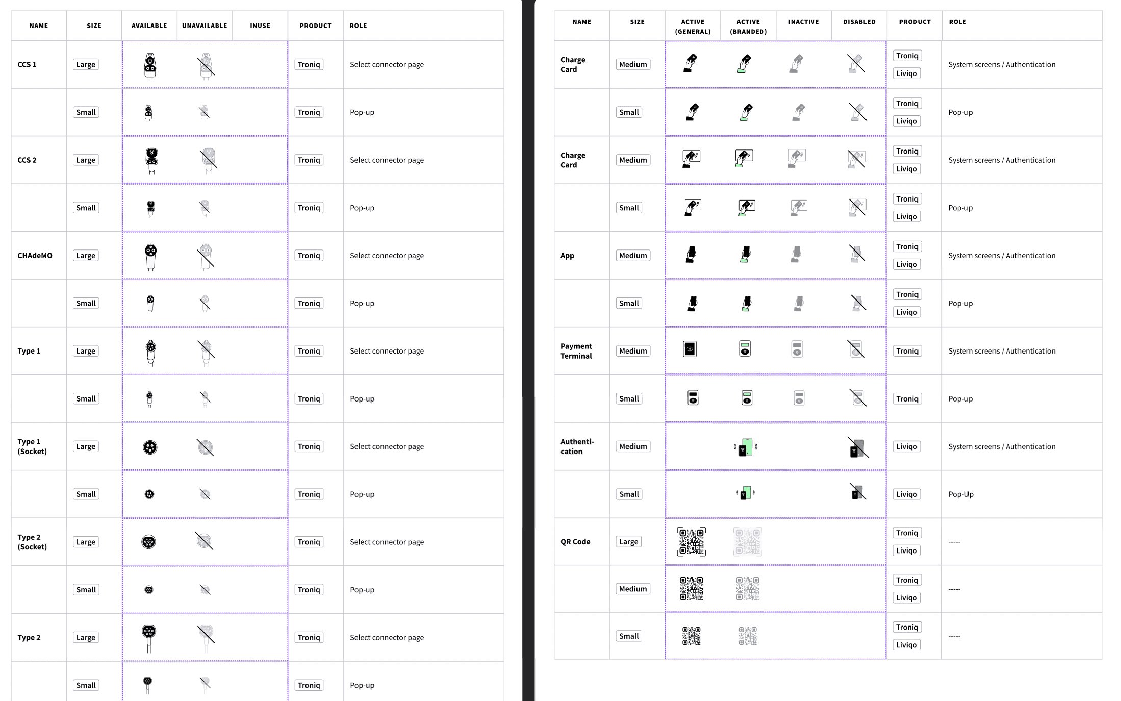
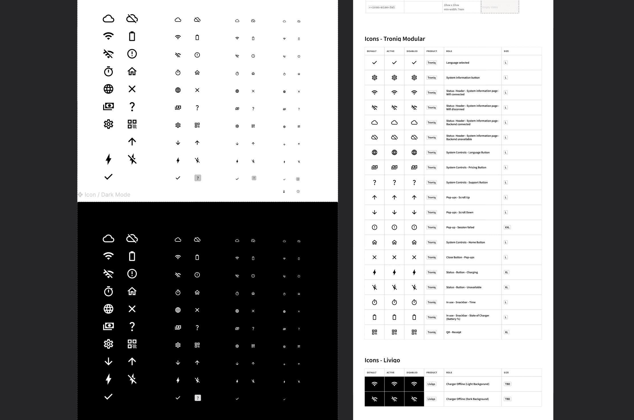
*Picture of the product-specific sub-system that mapped each component to its exact step in the UI flow.
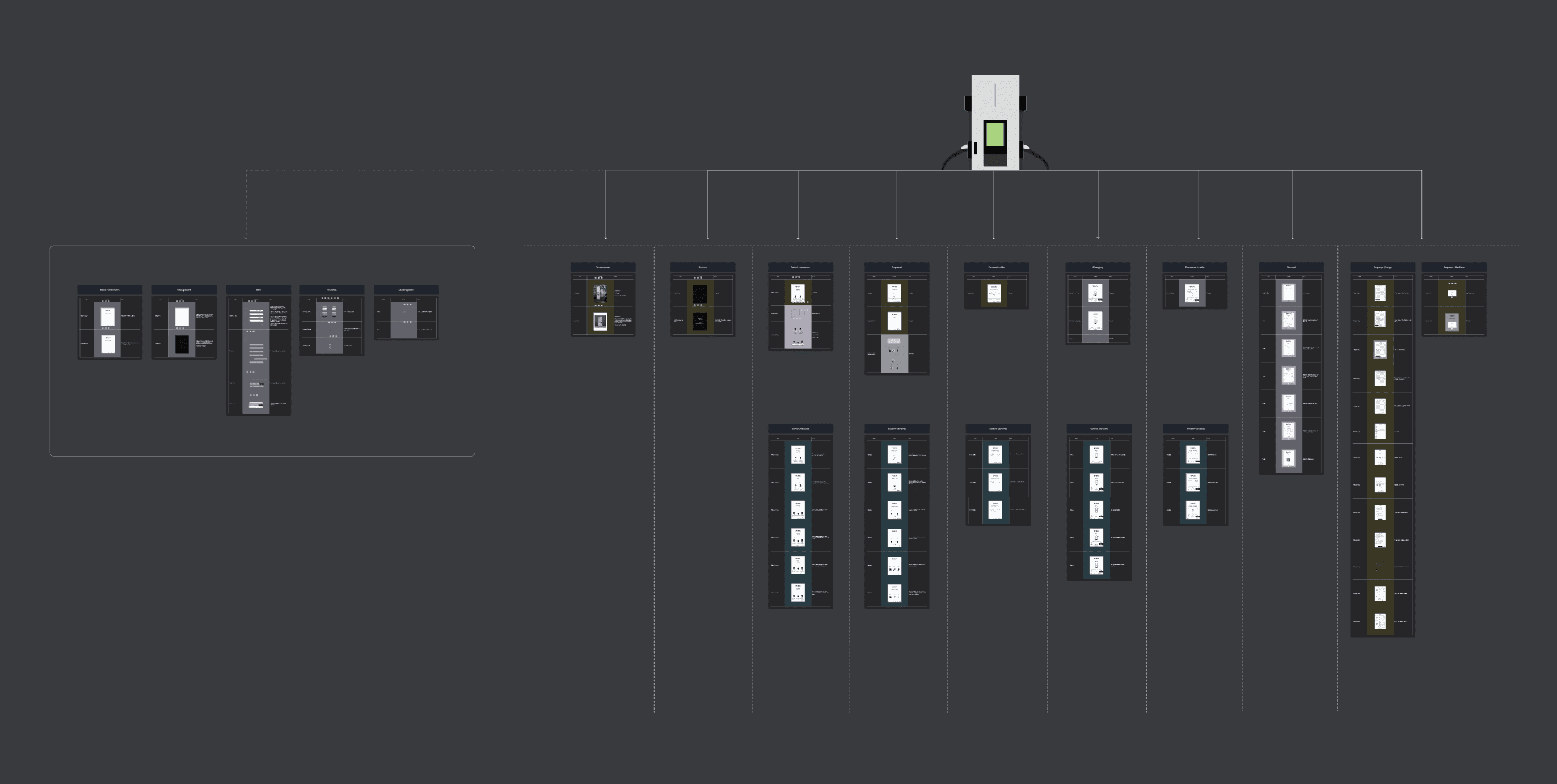
Result: Faster development and onboarding – teams immediately understood where each component belongs in the flow. Consistent visual execution – ensured the UI looked and behaved predictably across markets. Reduced errors and miscommunication – fewer iterations and smoother handoffs between design, development, and QA. Scalable and adaptable framework – ready to accommodate future updates, brand customisations, and evolving user needs without rework.
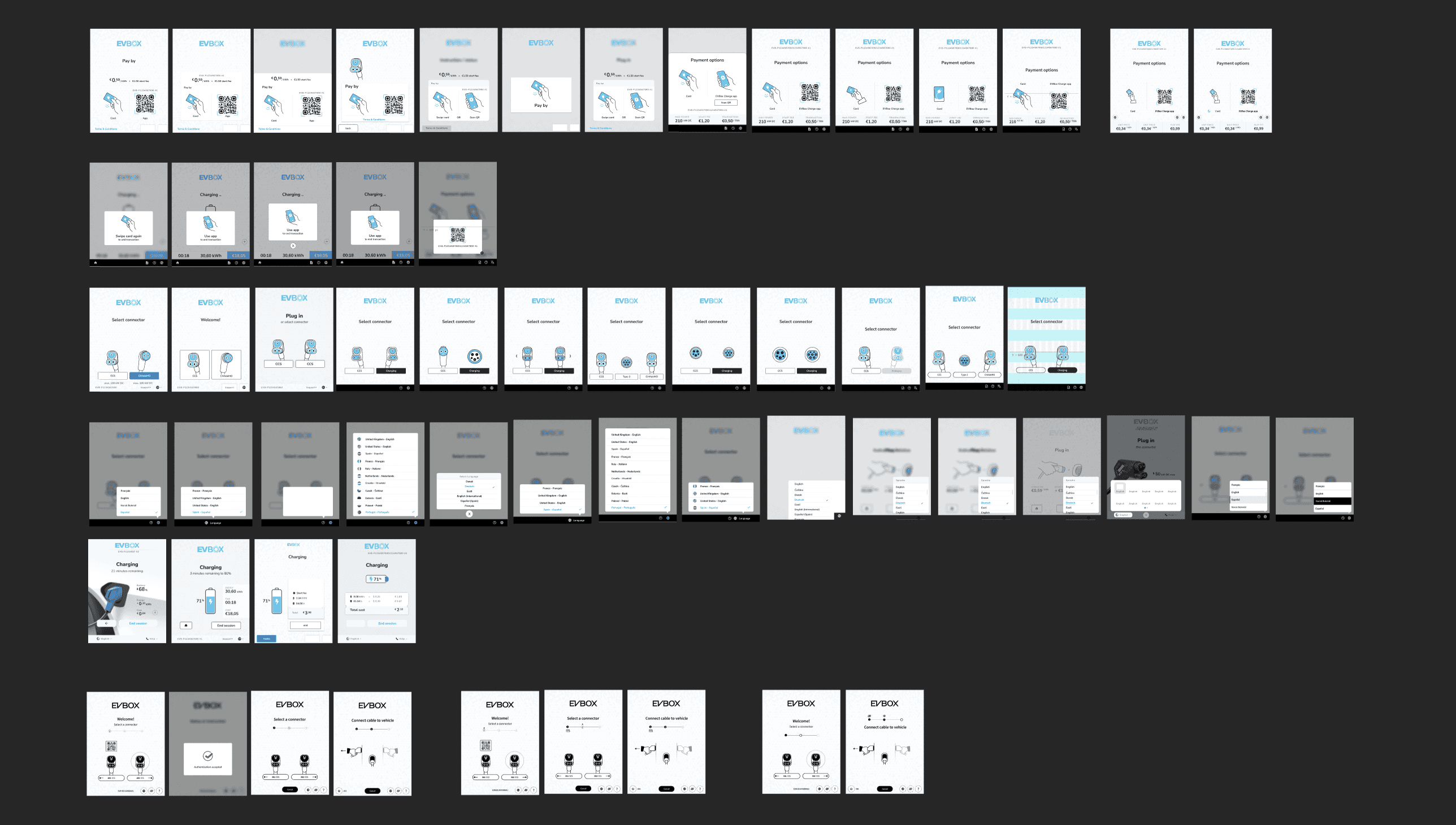
2/2 Hi-Fidelity Designs & Overall Solution
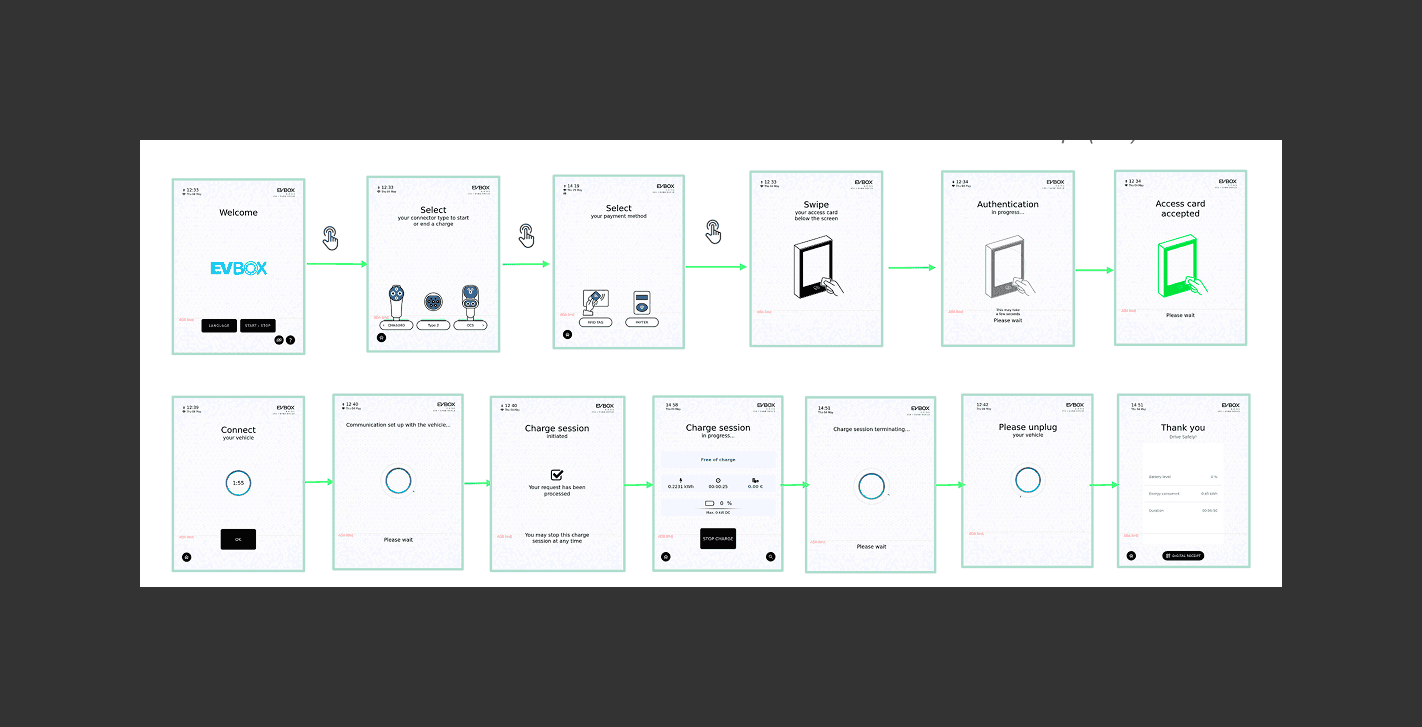
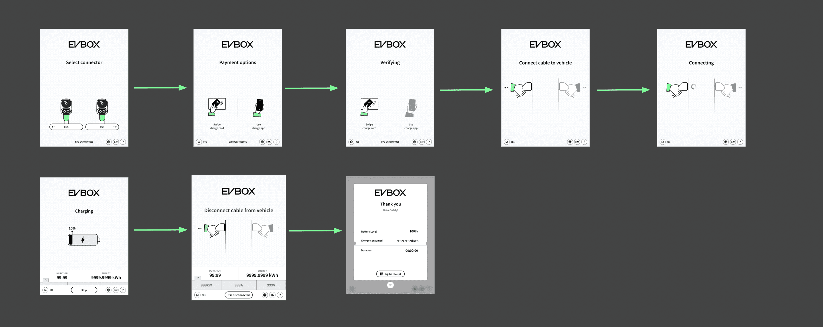
Solution for High interaction overhead: 13 steps in the main flow compared to a potential 5–6 in optimised flows.
*Old UI (v4.4)
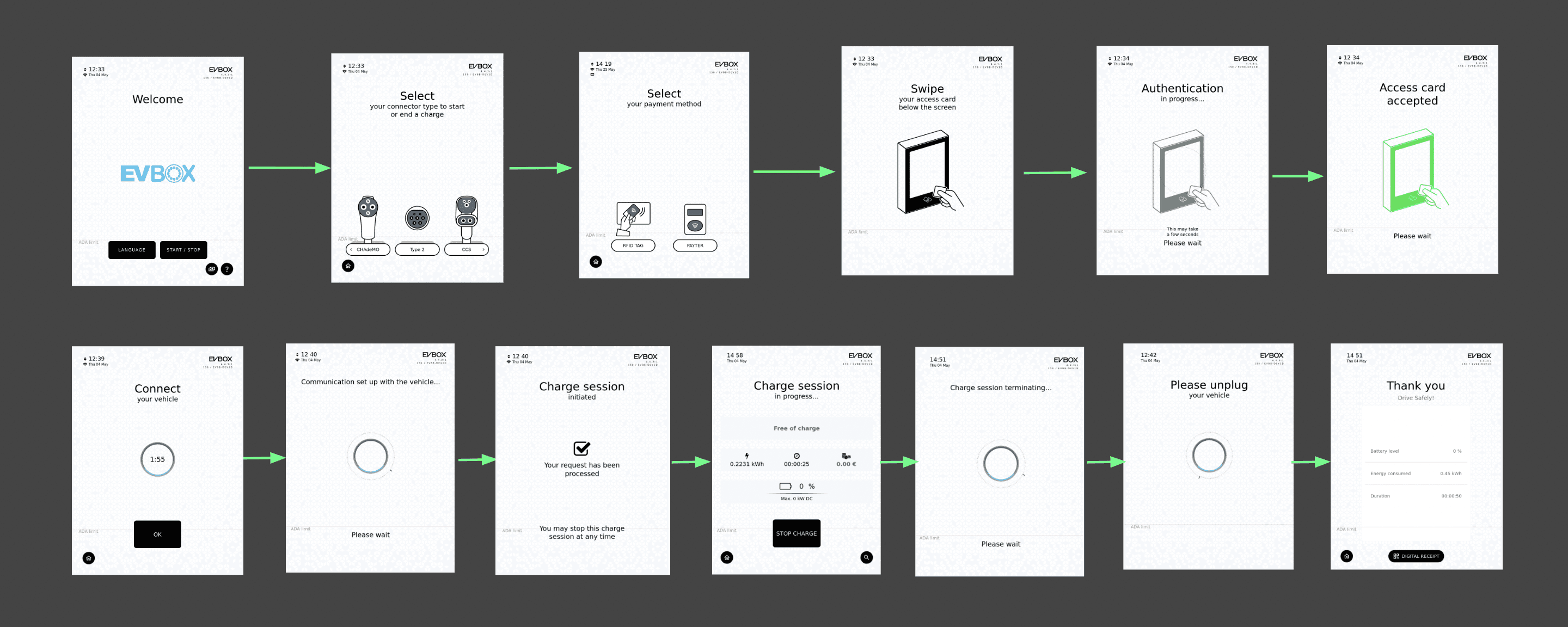
*New UI (v5.0) With reduced number of steps
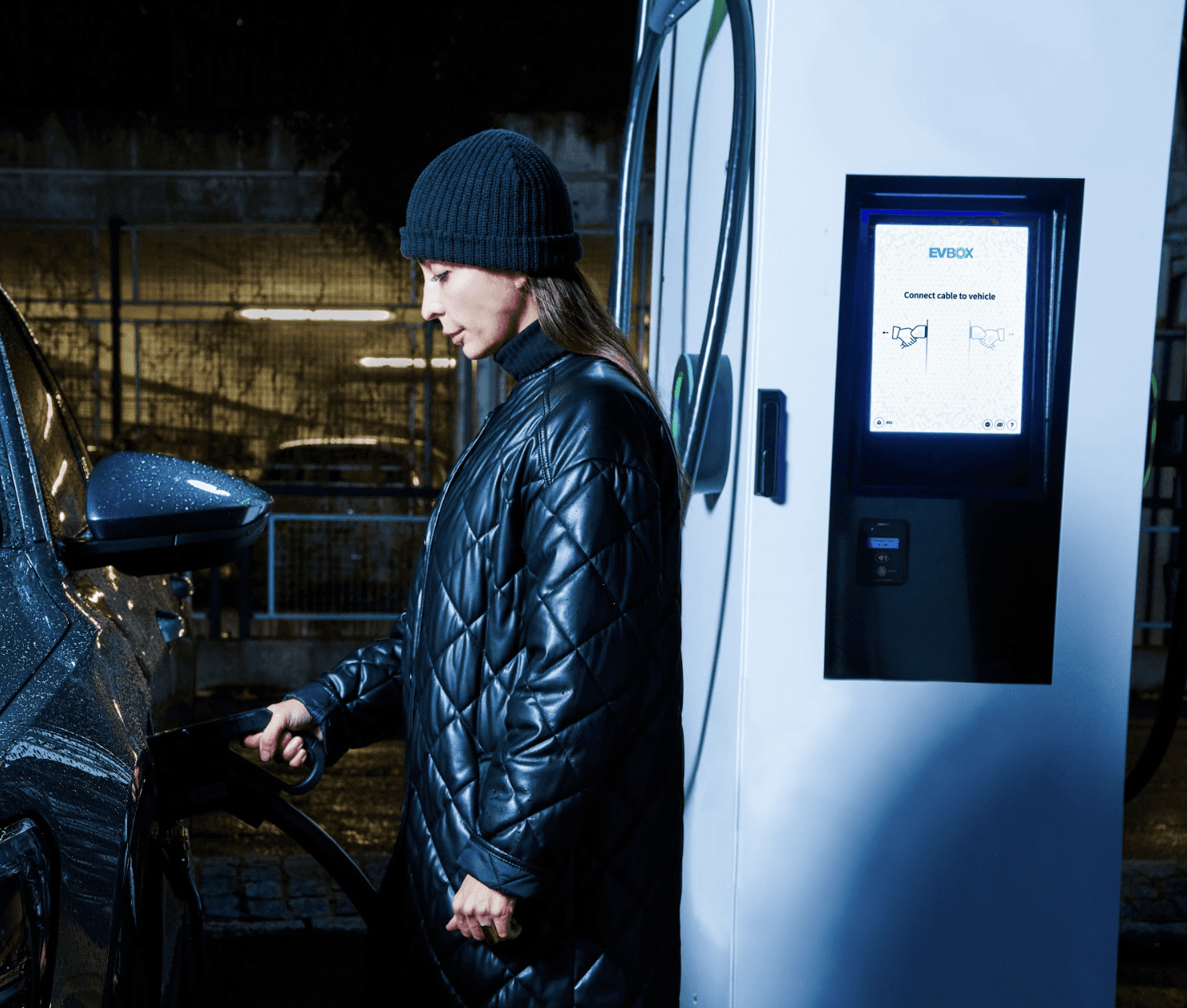
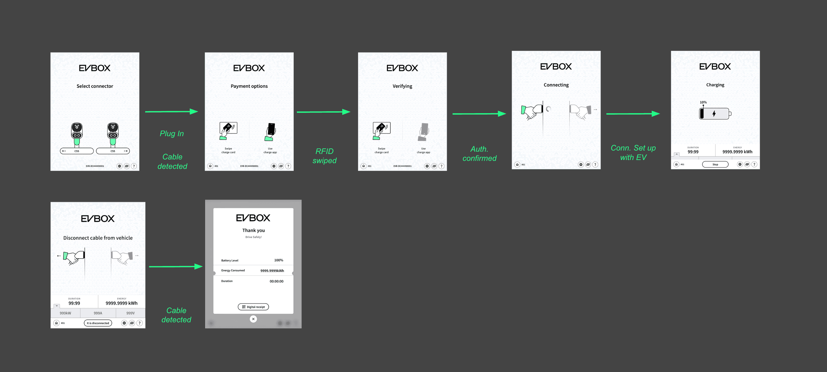
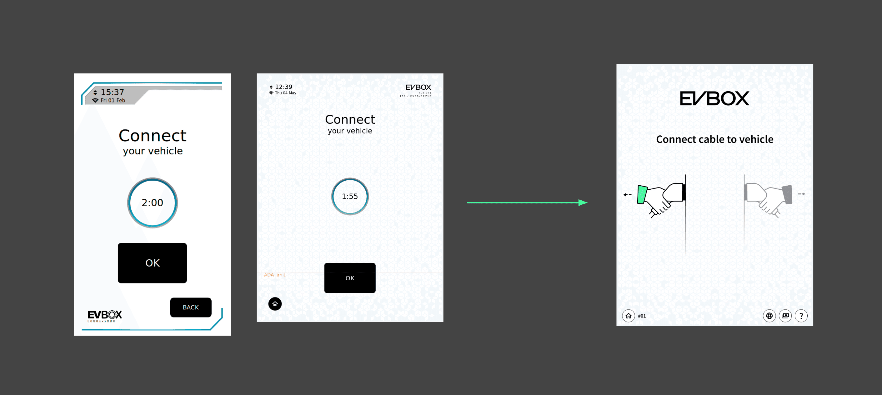
Solution for Rigid flows: that UI didn’t adapt to user behaviour (e.g., “plug first” scenarios unsupported).
*Old UI (v4.4): If users didn’t follow the instructions on the screen but plugged in the cable directly or swiped their payment card, the system would not respond at all.

*New UI (v5.0) If users skipped the steps on the screen and swiped their payment card, the system now will adapt and allow them to proceed in their journey.
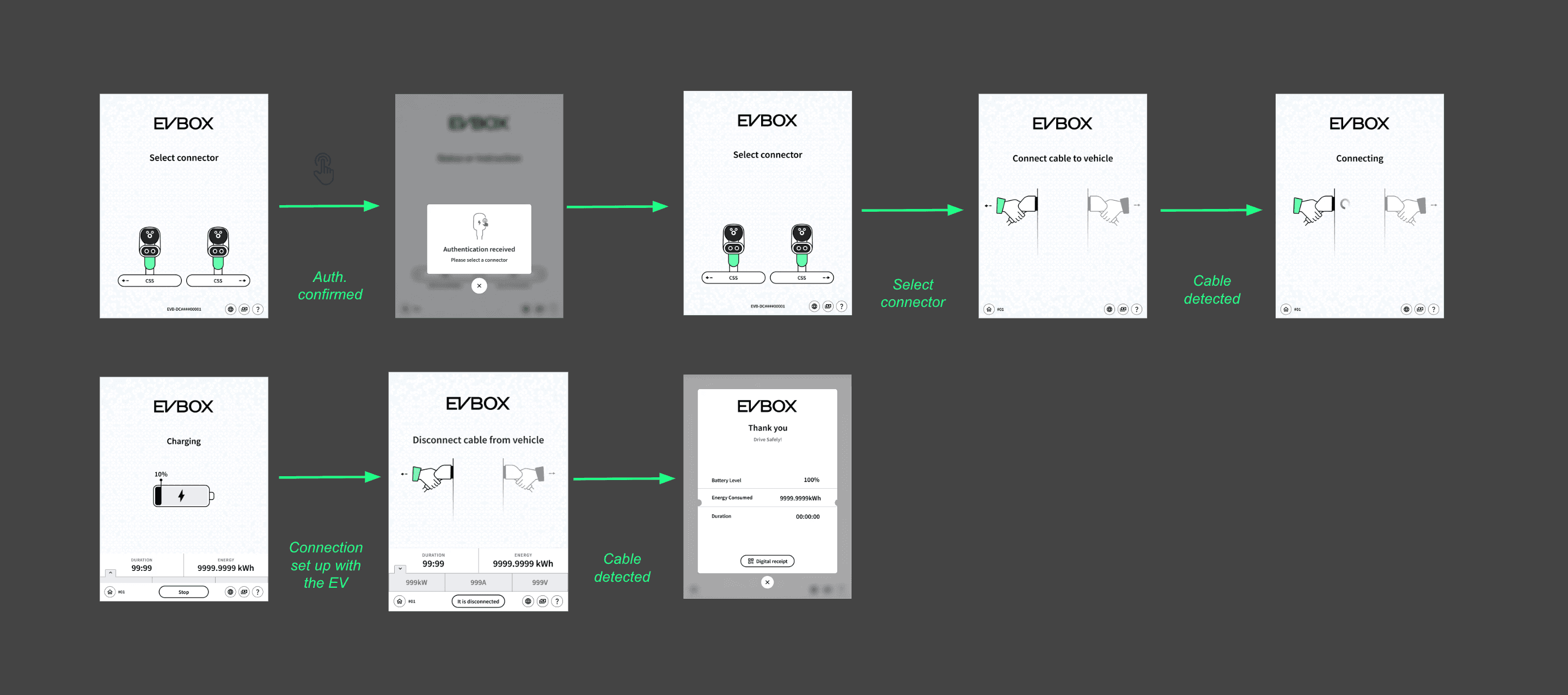
*New UI (v5.0) If users skipped the steps on the screen and plugged in the cable directly, the system now will adapt and allows them to proceed in their journey.
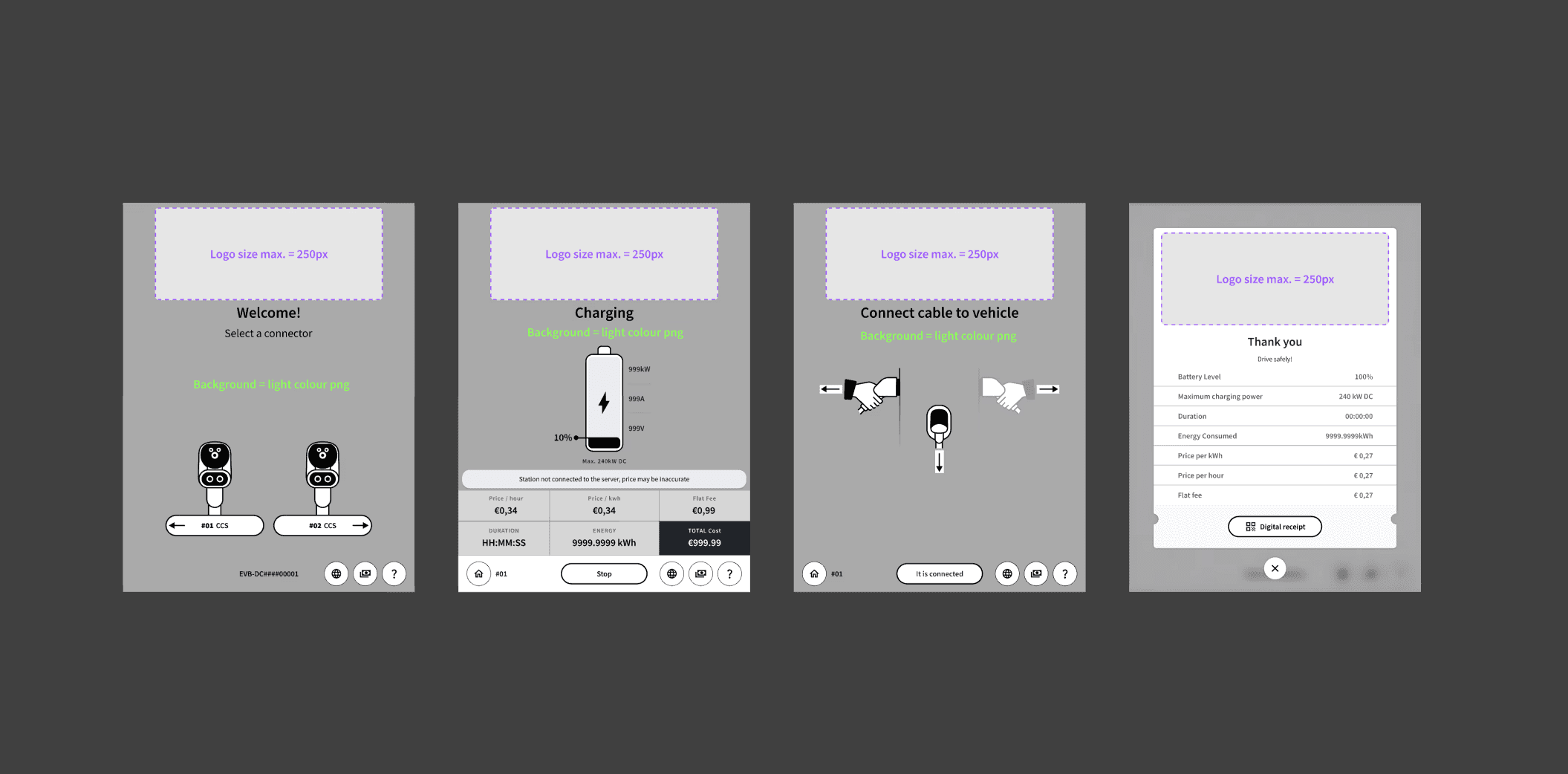
Solution to white label: Introduced brand colour customisation alongside logos and images, enabling faster and more flexible white-labelling without compromising usability.
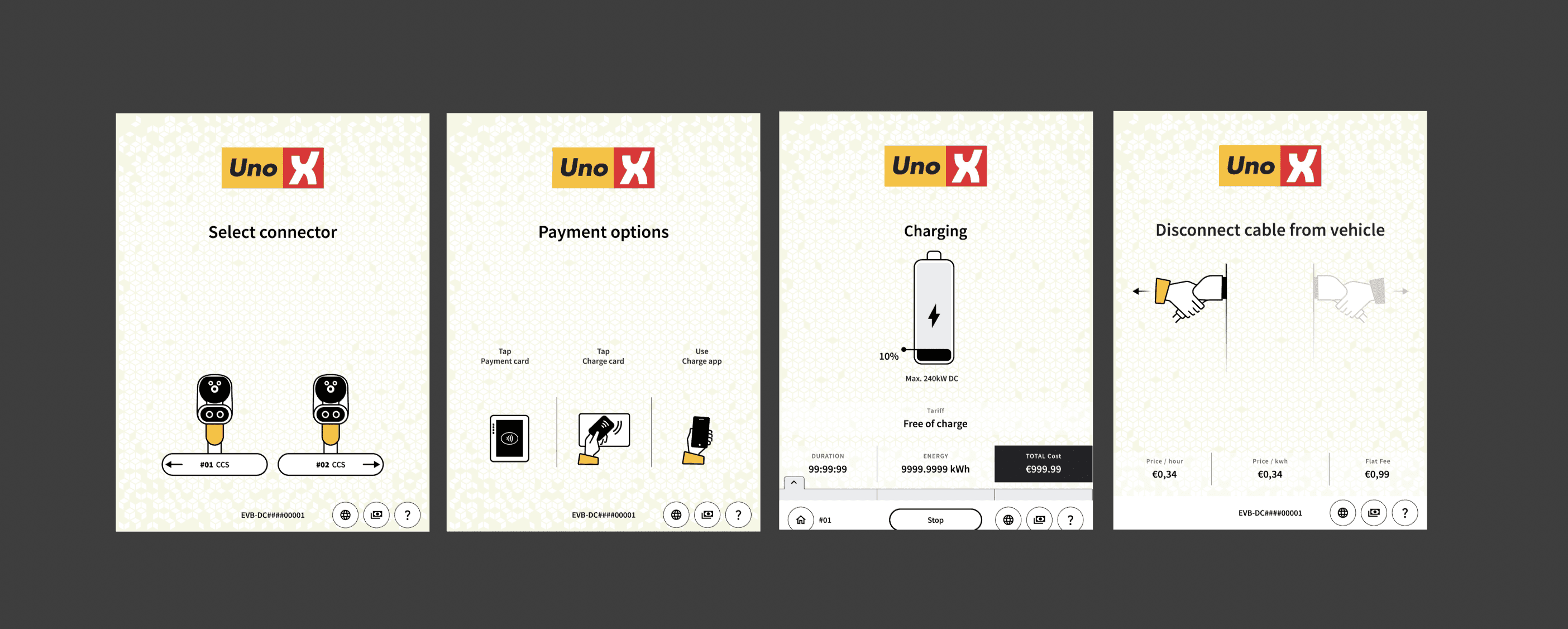
Solution for Limited guidance: Added clear, step-by-step guidance for physical actions like cable selection, highlighting the active cable for connection, preventing user errors and streamlining the charging process.
Solution for Inconsistent accessibility: Resolved inconsistent accessibility by enabling language changes at all stages of the charger, adding a footer with a language button, and removing country flags to avoid language-country conflicts.
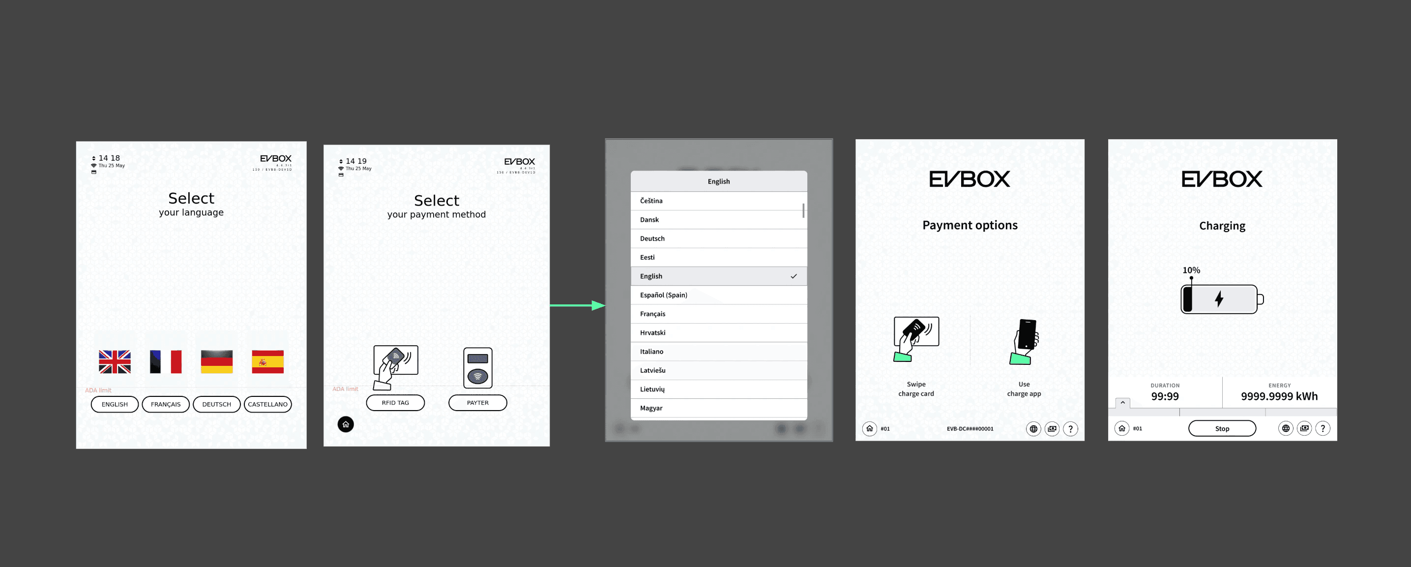
Solution to overloaded information hierarchy: Simplified the information hierarchy by removing version numbers, dates, and long sentences, making essential details clear and translations easier to maintain.
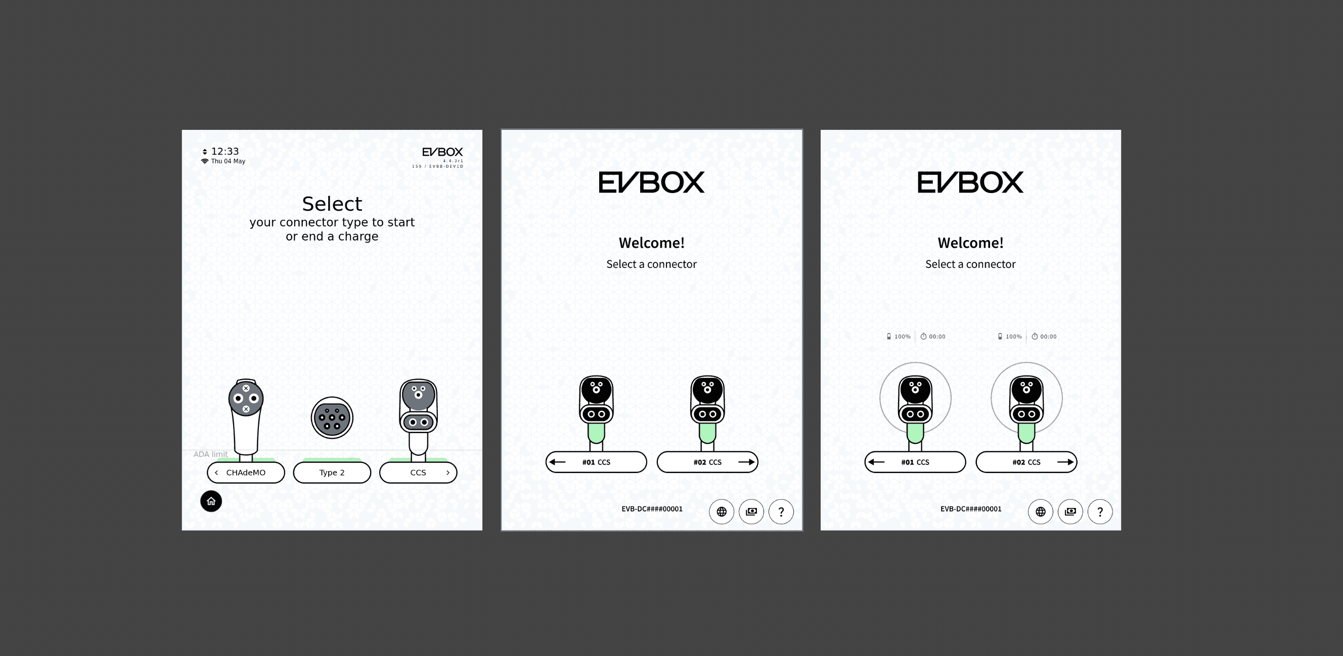
Solution to Wheelchair accessibly: Enhanced wheelchair accessibility by limiting all interactions to the bottom of the screen, ensuring controls are easily reachable for all users.
I used to look at a screen and think, “This could look better,” or “Why is this element even here?” But working on this project was a wake-up call. I realised that what’s visible is only the tip of the iceberg - every pixel is shaped by technical constraints, brand guidelines, regulatory requirements, and system limitations. While designing UI, it's easy to fall into the bias of believing that better visuals automatically mean better UX, or that small changes are “quick fixes.” In reality, those “quick fixes” often aren’t quick at all - they need to be engineered, can be expensive, and require deep research and thought to ensure solutions work long-term. Here, I learned that good UI isn’t just about aesthetics - it’s about solving problems within real-world boundaries, making complex systems feel simple, and respecting the invisible rules that keep everything working. That’s where true growth happens. - My thoughts